纯html+css3鼠标经过左右晃动特效
1、新建html文档。

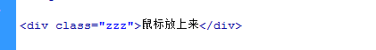
2、书写hmtl代码。<div class="zzz">鼠标放上来</div>
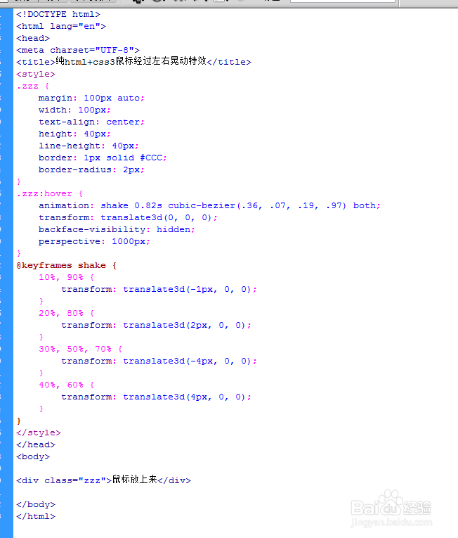
3、书写css代码。
<style>
.zzz {
margin: 100px auto;
width: 100px;
text-align: center;
height: 40px;
line-height: 40px;
border: 1px solid #CCC;
border-radius: 2px;
}
.zzz:hover {
animation: shake 0.82s cubic-bezier(.36, .07, .19, .97) both;
transform: translate3d(0, 0, 0);
backface-visibility: hidden;
perspective: 1000px;
}
@keyframes shake {
10%, 90% {
transform: translate3d(-1px, 0, 0);
}
20%, 80% {
transform: translate3d(2px, 0, 0);
}
30%, 50%, 70% {
transform: translate3d(-4px, 0, 0);
}
40%, 60% {
transform: translate3d(4px, 0, 0);
}
}
</style>

4、代码整体结构。
5、查看效果。

声明:本网站引用、摘录或转载内容仅供网站访问者交流或参考,不代表本站立场,如存在版权或非法内容,请联系站长删除,联系邮箱:site.kefu@qq.com。
阅读量:111
阅读量:109
阅读量:169
阅读量:102
阅读量:24