jQuery+CSS3一天时段动画特效
1、新建html文档。

2、书写hmtl代码。
<div class="main-content">
<h1>一天中最喜欢的时段是什么时候?</h1>
<div class="window">
<div class="cat"> <svg width="80px" viewBox="0 0 15.59 15.59">
<path d="M14.42,11.993c-0.104-1.334-0.709-2.336-1.57-3.153c-0.479-0.449-0.906-0.563-1.414-0.563c0,0-0.204,0.005-0.041,0.212 c0.215,0.271,1.791,2.328,1.768,4.011c-0.029,1.948-1.958,1.837-1.958,1.837c0.812-1.542,0.402-3.001,0.276-3.512 c-0.238-0.943-0.709-1.857-1.417-2.738C9.191,6.988,8.312,6.468,7.425,6.523c-0.379-0.654-0.716-1.18-1.011-1.61 C8.02,3.479,6.974,2.787,6.063,0c-0.211,0.591-0.38,1.028-0.507,1.31c-0.644-0.08-2.071-0.08-2.714,0 C2.716,1.028,2.547,0.591,2.336,0C1.423,2.794,0.374,3.467,1.999,4.909c0.173,3.278,0.849,4.149,1.942,5.732 c0.9,1.304,0.675,1.768,1.098,3.569c-3.197,2.014,2.223,1.241,3.063,1.2C10.266,15.305,14.777,16.6,14.42,11.993z"></path>
</svg> </div>
<div class="illustration">
<div class="time dusk">
<div class="sky"> <svg width="250px" viewBox="0 0 113.39 99.21">
<linearGradient id="sky_sunset" gradientUnits="userSpaceOnUse" x1="0%" y1="0%" x2="100%" y2="0%" gradientTransform="rotate(-25)">
<stop offset="0%" stop-color="#f7ffa9" stop-opacity="1"></stop>
<stop offset="40%" stop-color="#ffcc33" stop-opacity="1"></stop>
<stop offset="100%" stop-color="#ffbe1d" stop-opacity="1"></stop>
</linearGradient>
<linearGradient id="sky_dusk" gradientUnits="userSpaceOnUse" x1="0%" y1="0%" x2="100%" y2="0%" gradientTransform="rotate(45)">
<stop offset="0%" stop-color="#ffd4fe" stop-opacity="1"></stop>
<stop offset="30%" stop-color="#ffd4fe" stop-opacity="1"></stop>
<stop offset="100%" stop-color="#ffd26a" stop-opacity="1"></stop>
</linearGradient>
<polygon fill="#B3EFFF" id="sky" points="111.971,97.368 111.971,1.842 1.419,1.842 1.419,9.042 1.419,97.368"></polygon>
</svg> </div>
<div class="sun"> <svg width="90px" viewBox="0 0 90.71 90.71">
<g>
<circle opacity="0.1" fill="#FFECDC" cx="45.355" cy="45.354" r="43.212"></circle>
<circle opacity="0.3" fill="#FFEBDE" cx="45.355" cy="45.354" r="31.131"></circle>
<circle id="sun" fill="#f9db5a" cx="45.355" cy="45.354" r="21.374"></circle>
</g>
</svg> </div>
<div class="clouds"> <svg width="80px" viewBox="0 0 42.52 19.84">
<g>
<path fill="#fff" d="M38.582,8.005c1.865,0,3.393,1.673,3.393,3.717l0,0c0,2.042-1.527,3.716-3.393,3.716H24.039h-0.484 c-2.676,0-4.847-2.378-4.847-5.309c0-2.932,2.17-5.309,4.847-5.309c0,0,2.242-4.247,7.756-4.247c3.453,0,6.787,1.925,6.787,7.432 H38.582z"></path>
<path fill="#FCFCFC" d="M20.863,11.667c1.908,0,3.471,1.71,3.471,3.8l0,0c0,2.09-1.563,3.8-3.471,3.8H5.998H5.501 c-2.736,0-4.956-2.431-4.956-5.428s2.219-5.428,4.956-5.428c0,0,2.292-4.342,7.929-4.342c3.532,0,6.939,1.968,6.939,7.598H20.863z"></path>
</g>
</svg> </div>
<div class="stars"> <svg width="210px" viewBox="0 0 99.21 25.51">
<g>
<ellipse opacity="0.3" fill="#FFFFFF" cx="97.067" cy="11.361" rx="0.727" ry="0.832"></ellipse>
<ellipse opacity="0.3" fill="#FFFFFF" cx="2.144" cy="3.901" rx="0.728" ry="0.831"></ellipse>
<ellipse opacity="0.3" fill="#FFFFFF" cx="14.743" cy="10.455" rx="0.727" ry="0.831"></ellipse>
<ellipse opacity="0.3" fill="#FFFFFF" cx="66.439" cy="9.407" rx="0.728" ry="0.831"></ellipse>
<ellipse opacity="0.3" fill="#FFFFFF" cx="77.518" cy="1.332" rx="0.728" ry="0.831"></ellipse>
<ellipse opacity="0.3" fill="#FFFFFF" cx="82.514" cy="13.459" rx="0.728" ry="0.831"></ellipse>
</g>
</svg> </div>
<div class="moon"> <svg width="35px" viewBox="0 0 15.59 19.28">
<path opacity="0.8" fill="#FFFFFF" d="M13.718,16.993c-5.085,0-9.208-4.122-9.208-9.208c0-2.97,1.407-5.608,3.589-7.292 C3.722,1.205,0.381,5,0.381,9.579c0,5.086,4.123,9.208,9.209,9.208c2.116,0,4.063-0.716,5.619-1.916 C14.722,16.95,14.226,16.993,13.718,16.993z"></path>
</svg> </div>
<div class="mountain"> <svg width="250px" viewBox="0 0 113.39 36.85">
<path id="mountain" fill="#87D6D6" d="M111.971,0.478C106.576,2.7,95.837,16.269,88.655,15C81.29,13.699,68.052,6.244,62.31,3.639 C56.566,1.036,41.955,16.42,36.835,15.948c-5.118-0.474-17.355-9.232-23.475-8.403c-3.964,0.537-8.932,4.276-11.941,6.844v21.983 h110.552V0.478z"></path>
</svg> </div>
<div class="hill"> <svg width="250px" viewBox="0 0 113.39 17.86">
<path id="hill" fill="#38C6B1" d="M111.971,12.132c-4.609-0.766-8.889-1.889-12.432-3.579C86.127-0.36,71.48-3.606,43.082,6.31 c-6.086,0.811-7.853,0.51-17.234-2.951C18.487,0.644,8.764,1.176,1.419,2.621v15.017h110.551V12.132z"></path>
</svg> </div>
<div class="land"> <svg width="250px" viewBox="0 0 113.39 24.09">
<path id="land" fill="#4CB5AB" d="M111.971,23.82V3.328C84.865-6.96,12.407,11.765,1.419,14.708v9.112H111.971z"></path>
</svg> </div>
<div class="trees"> <svg width="210px" viewBox="0 0 85.04 41.1">
<g>
<rect class="trunks" x="75.121" y="26.724" fill="#8C5F50
<rect class="trunks" x="67.539" y="28.89" fill="#8C5F50
</g>
<g>
<path class="trees" fill="#A0D755" d="M83.785,21.309c0,4.187-3.393,7.581-7.58,7.581s-7.582-3.395-7.582-7.581 c0-9.749,3.395-20.579,7.582-20.579S83.785,11.56,83.785,21.309z"></path>
<path class="trees" fill="#A0D755" d="M75.121,24.933c0,3.382-2.91,6.125-6.5,6.125c-3.588,0-6.498-2.743-6.498-6.125 c0-7.873,2.91-16.622,6.498-16.622C72.211,8.311,75.121,17.06,75.121,24.933z"></path>
</g>
<g opacity="0.2">
<path fill="#FFFFFF" d="M72.955,21.309c0-8.892,1.883-18.68,4.332-20.333c-0.354-0.16-0.715-0.247-1.082-0.247 c-4.188,0-7.582,10.83-7.582,20.579c0,4.187,3.395,7.581,7.582,7.581c0.369,0,0.729-0.035,1.082-0.086 C74.84,28.277,72.955,25.127,72.955,21.309z"></path>
<path fill="#FFFFFF" d="M66.457,24.933c0-7.106,1.383-14.901,3.191-16.359c-0.334-0.157-0.676-0.263-1.025-0.263 c-3.588,0-6.5,8.749-6.5,16.622c0,3.382,2.912,6.125,6.5,6.125c0.35,0,0.691-0.034,1.025-0.084 C67.84,30.508,66.457,27.984,66.457,24.933z"></path>
</g>
<g>
<rect class="trunks" x="3.466" y="35.946" fill="#8C5F50
<path class="trees" fill="#A0D755" d="M7.153,34.472c0,1.628-1.32,2.949-2.949,2.949S1.254,36.1,1.254,34.472c0-5.162,1.32-11.799,2.949-11.799 S7.153,29.31,7.153,34.472z"></path>
<path opacity="0.2" fill="#FCFCFC" d="M3.466,34.472c0-4.233,0.666-9.452,1.58-11.194c-0.267-0.383-0.55-0.604-0.842-0.604 c-1.629,0-2.949,6.637-2.949,11.799c0,1.628,1.32,2.949,2.949,2.949c0.295,0,0.573-0.057,0.842-0.137 C4.135,36.919,3.466,35.806,3.466,34.472z"> </path>
</g>
</svg> </div>
</div>
</div>
</div>
<div class="option-wrapper">
<div class="option active" data-option="dusk">黄昏</div>
<div class="option" data-option="day">白天</div>
<div class="option" data-option="sunset">日落</div>
<div class="option" data-option="night">夜晚</div>
</div>
</div>

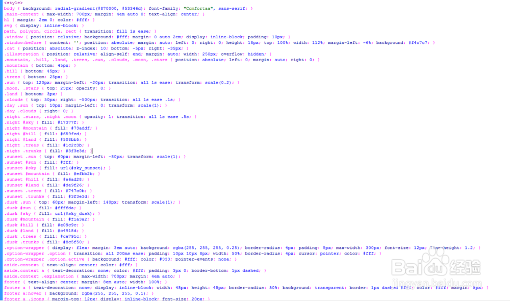
3、书写css代码。
<style>
body { background: radial-gradient(#870000, #53346d); font-family: "Comfortaa", sans-serif; }
.main-content { max-width: 700px; margin: 4em auto 0; text-align: center; }
h1 { margin: 2em 0; color: #fff; }
svg { display: inline-block; }
path, polygon, circle, rect { transition: fill 1s ease; }
.window { position: relative; background: #fff; margin: 0 auto 2em; display: inline-block; padding: 10px; }
.window:before { content: ''; position: absolute; margin: auto; left: 0; right: 0; height: 18px; top: 100%; width: 112%; margin-left: -6%; background: #f4c7c7; }
.cat { position: absolute; z-index: 10; bottom: -5px; right: -35px; }
.illustration { position: relative; align-self: end; margin: auto; width: 250px; overflow: hidden; }
.mountain, .hill, .land, .trees, .sun, .clouds, .moon, .stars { position: absolute; left: 0; margin: auto; right: 0; }
.mountain { bottom: 45px; }
.hill { bottom: 45px; }
.trees { bottom: 25px; }
.sun { top: 120px; margin-left: -20px; transition: all 1s ease; transform: scale(0.2); }
.moon, .stars { top: 25px; opacity: 0; }
.land { bottom: 3px; }
.clouds { top: 50px; right: -500px; transition: all 1s ease .1s; }
.day .sun { top: 10px; margin-left: 0; transform: scale(1); }
.day .clouds { right: 0; }
.night .stars, .night .moon { opacity: 1; transition: all 1s ease .5s; }
.night #sky { fill: #17377f; }
.night #mountain { fill: #73addf; }
.night #hill { fill: #659fcd; }
.night #land { fill: #508bb5; }
.night .trees { fill: #1c2c3b; }
.night .trunks { fill: #3f3e3d; }
.sunset .sun { top: 60px; margin-left: -80px; transform: scale(1); }
.sunset #sun { fill: #fff; }
.sunset #sky { fill: url(#sky_sunset); }
.sunset #mountain { fill: #efbb2b; }
.sunset #hill { fill: #e6ad28; }
.sunset #land { fill: #de9f26; }
.sunset .trees { fill: #747c0b; }
.sunset .trunks { fill: #3f3e3d; }
.dusk .sun { top: 60px; margin-left: 140px; transform: scale(1); }
.dusk #sun { fill: #ffffda; }
.dusk #sky { fill: url(#sky_dusk); }
.dusk #mountain { fill: #f1a3a2; }
.dusk #hill { fill: #e09c9c; }
.dusk #land { fill: #c4918d; }
.dusk .trees { fill: #ce791c; }
.dusk .trunks { fill: #8c5f50; }
.option-wrapper { display: flex; margin: 3em auto; background: rgba(255, 255, 255, 0.25); border-radius: 4px; padding: 5px; max-width: 300px; font-size: 12px; line-height: 1.2; }
.option-wrapper .option { transition: all 200ms ease; padding: 10px 10px 8px; width: 50%; border-radius: 4px; cursor: pointer; color: #fff; }
.option-wrapper .option.active { background: #fff; color: #333; pointer-events: none; }
aside.context { text-align: center; color: #fff; }
aside.context a { text-decoration: none; color: #fff; padding: 3px 0; border-bottom: 1px dashed; }
aside.context .explanation { max-width: 700px; margin: 4em auto; }
footer { text-align: center; margin: 8em auto; width: 100%; }
footer a { text-decoration: none; display: inline-block; width: 45px; height: 45px; border-radius: 50%; background: transparent; border: 1px dashed #fff; color: #fff; margin: 5px; }
footer a:hover { background: rgba(255, 255, 255, 0.1); }
footer a .icons { margin-top: 12px; display: inline-block; font-size: 20px; }
</style>
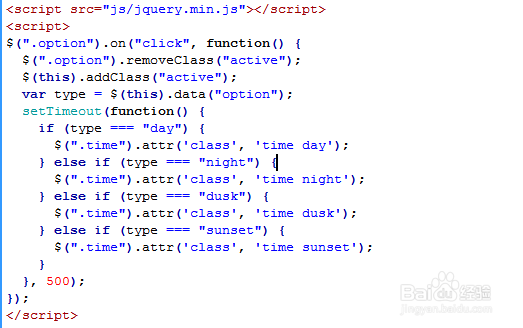
4、书写并添加js代码。
<script src="js/jquery.min.js"></script>
<script>
$(".option").on("click", function() {
$(".option").removeClass("active");
$(this).addClass("active");
var type = $(this).data("option");
setTimeout(function() {
if (type === "day") {
$(".time").attr('class', 'time day');
} else if (type === "night") {
$(".time").attr('class', 'time night');
} else if (type === "dusk") {
$(".time").attr('class', 'time dusk');
} else if (type === "sunset") {
$(".time").attr('class', 'time sunset');
}
}, 500);
});
</script>
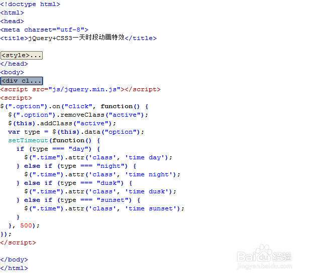
5、代码整体结构。
6、查看效果。