CSS3 弹性盒子之flex-direction
1、1、弹性盒子由弹性容器和弹性子元素组成
2、弹性容器通过设置 display 属性的值为 flex 或 inline-flex将其定义为弹性容器。
3、弹性容器内包含了一个或多个弹性子元素。
例子:
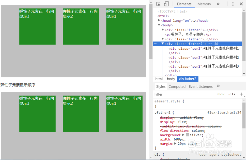
弹性子元素在一英慎躲行内显示
css部分:
.father{ /*direction: rtl;*/
display:-webkit-flex;
display: flex;
background: silver;
width:600px;
三耍 height:300px;
margin:20px auto;
}
.son{
width:150px;
height:150px;
background:burlywood;
margin: 15px;
color: #fff;;
}
html部分:
<div class="father">
<div class="son">弹性子元素在一行内显示1</div>
<div class="son">弹性子元素在一行内显示2</div>
随捧 <div class="son">弹性子元素在一行内显示3</div>
</div>
效果如图:

1、flex-direction 指定了弹性子元素在父容器中的显示顺序
flex-direction: row /row-reverse /column / column-reverse
row:横向从左到右排列(左对齐),默认的排列方式。
row-reverse:反转横向排列(右对齐,从后往前排,最后一项排在最前面。
column:纵向排列。
column-reverse:反转纵向排列,从后往前排,最后一项排在最上面
2、flex-direction:row-reverse;
弹性子元素反转横向排列(右对齐,从后往前排,最后一项排在最前面
例子:
css部分:
.father{
display:-webkit-flex;
display: flex;
-webkit-flex-direction: row-reverse;
flex-direction: row-reverse;
background: silver;
width:600px;
height:300px;
margin:20px auto;
}
.son{
width:150px;
height:150px;
background:burlywood;
margin: 15px;
color: #fff;;
}
html部分:
<div class="father">
<div class="son">弹性子元素在一行内显示1</div>
<div class="son">弹性子元素在一行内显示2</div>
<div class="son">弹性子元素在一行内显示3</div>
</div>
效果如图:
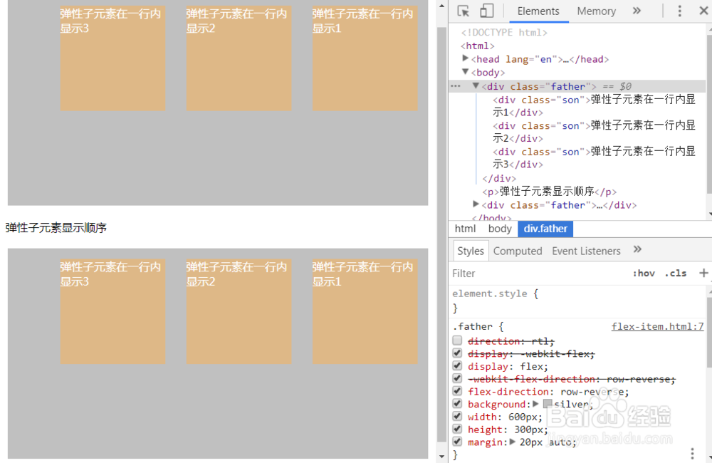
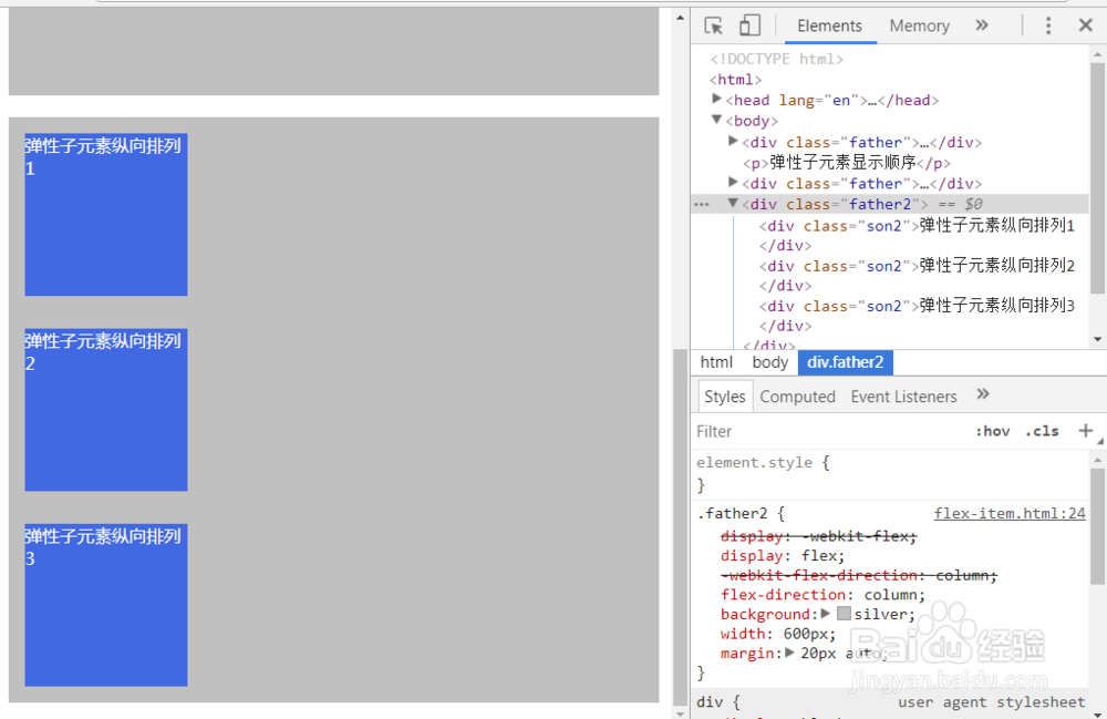
3、flex-direction:row-reverse;
弹性盒子子元素纵向排列
例子:
css部分:
.father2{
display:-webkit-flex;
display: flex;
-webkit-flex-direction: column;
flex-direction: column;
background: silver;
width:600px;
margin:20px auto;
}
.son2{
width:150px;
height:150px;
background:royalblue;
margin: 15px;
color: #fff;;
}
html部分:
<div class="father2">
<div class="son2">弹性子元素纵向排列1</div>
<div class="son2">弹性子元素纵向排列2</div>
<div class="son2">弹性子元素纵向排列3</div>
</div>
效果如图:
4、flex-direction:column-reverse;
反转纵向排列,从后往前排,最后一项排在最上面
例子:
css部分:
.father3{
display:-webkit-flex;
display: flex;
-webkit-flex-direction: column-reverse;
flex-direction: column-reverse;
background: silver;
width:600px;
margin:20px auto;
}
.son3{
width:150px;
height:150px;
background:red;
margin: 15px;
color: #fff;;
}
html部分:
<div class="father3">
<div class="son3">弹性子元素反纵向排列1</div>
<div class="son3">弹性子元素反纵向排列2</div>
<div class="son3">弹性子元素反纵向排列3</div>
</div>
效果如图:
