html+CSS3实现input输入框蓝光特效

3、书写hmtl代码。
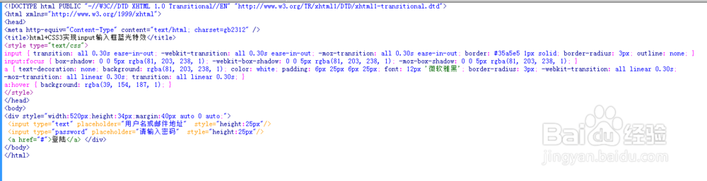
<style>
input { transition: all 0.30s ease-in-out; -webkit-transition: all 0.30s ease-in-out; -moz-transition: all 0.30s ease-in-out; border: #35a5e5 1px solid; border-radius: 3px; outline: none; }
input:focus { box-shadow: 0 0 5px rgba(81, 203, 238, 1); -webkit-box-shadow: 0 0 5px rgba(81, 203, 238, 1); -moz-box-shadow: 0 0 5px rgba(81, 203, 238, 1); }
a { text-decoration: none; background: rgba(81, 203, 238, 1); color: white; padding: 6px 25px 6px 25px; font: 12px '微软雅黑'; border-radius: 3px; -webkit-transition: all linear 0.30s; -moz-transition: all linear 0.30s; transition: all linear 0.30s; }
a:hover { background: rgba(39, 154, 187, 1); }
</style>

4、整体代码结构
5、查看效果

声明:本网站引用、摘录或转载内容仅供网站访问者交流或参考,不代表本站立场,如存在版权或非法内容,请联系站长删除,联系邮箱:site.kefu@qq.com。
阅读量:167
阅读量:87
阅读量:31
阅读量:138
阅读量:21