>CSS3动态文字与背景同时切换特效
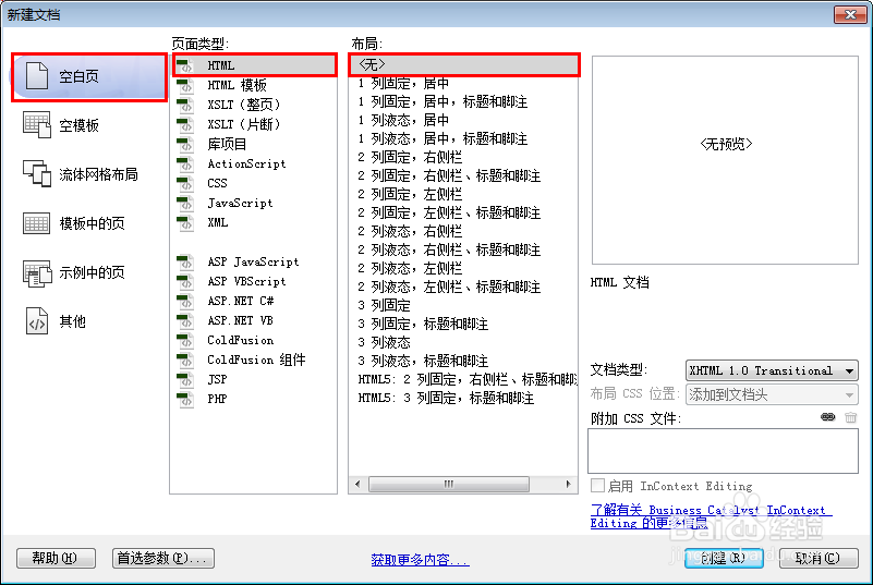
1、新建html文档。
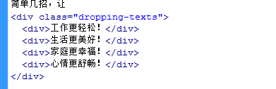
2、书写hmtl代码。
简单几招,让
<div class="dropping-texts">
<div>工作更轻松!</div>
<div>生活更美好!</div>
<div>家庭更幸福!</div>
<div>心情更舒畅!</div>
</div>
3、书写css代码。
body { margin: 0px; text-align: center; padding-top: 43vh; color: #fff; font-family: 'Microsoft YaHei', 'Lantinghei SC', 'Open Sans', Arial, 'Hiragino Sans GB', 'STHeiti', 'WenQuanYi Micro Hei', 'SimSun', sans-serif; font-size: 36px; font-weight: 100; overflow: hidden; ani mation: bg 5s linear infinite; }
.dropping-texts { display: inline-block; width: 180px; text-align: left; height: 38px; }
.dropping-texts > div { font-size: 0px; opacity: 0; margin-left: -30px; position: absolute; font-weight: 300; box-shadow: 0px 60px 25px -20px rgba(0,0,0,0.5); }
.dropping-texts > div:nth-child(1) { ani mation: roll 5s linear infinite 0s; }
.dropping-texts > div:nth-child(2) { ani mation: roll 5s linear infinite 1s; }
.dropping-texts > div:nth-child(3) { ani mation: roll 5s linear infinite 2s; }
.dropping-texts > div:nth-child(4) { ani mation: roll2 5s linear infinite 3s; }

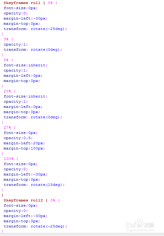
4、书写css3动画代码。
@keyframes roll { 0% {
font-size:0px;
opacity:0;
margin-left:-30px;
margin-top:0px;
transform: rotate(-25deg);
}
3% {
opacity:1;
transform: rotate(0deg);
}
5% {
font-size:inherit;
opacity:1;
margin-left:0px;
margin-top:0px;
}
20% {
font-size:inherit;
opacity:1;
margin-left:0px;
margin-top:0px;
transform: rotate(0deg);
}
27% {
font-size:0px;
opacity:0.5;
margin-left:20px;
margin-top:100px;
}
100% {
font-size:0px;
opacity:0;
margin-left:-30px;
margin-top:0px;
transform: rotate(15deg);
}
}
@keyframes roll2 { 0% {
font-size:0px;
opacity:0;
margin-left:-30px;
margin-top:0px;
transform: rotate(-25deg);
}
3% {
opacity:1;
transform: rotate(0deg);
}
5% {
font-size:inherit;
opacity:1;
margin-left:0px;
margin-top:0px;
}
30% {
font-size:inherit;
opacity:1;
margin-left:0px;
margin-top:0px;
transform: rotate(0deg);
}
37% {
font-size:1500px;
opacity:0;
margin-left:-1000px;
margin-top:-800px;
}
100% {
font-size:0px;
opacity:0;
margin-left:-30px;
margin-top:0px;
transform: rotate(15deg);
}
}
@keyframes bg { 0% {
background: #ff0075;
}
3% {
background: #0094ff;
}
20% {
background: #0094ff;
}
23% {
background: #b200ff;
}
40% {
background: #b200ff;
}
43% {
background: #8BC34A;
}
60% {
background: #8BC34A;
}
63% {
background: #F44336;
}
80% {
background: #F44336;
}
83% {
background: #F44336;
}
100% {
background: #F44336;
}
}
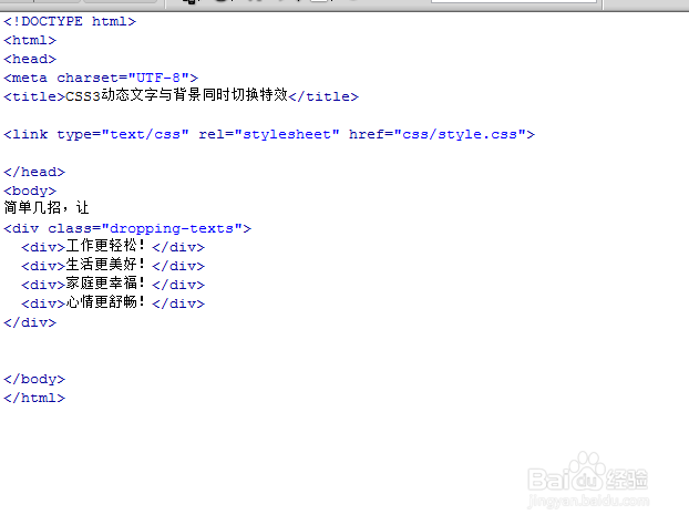
5、代码整体结构。
6、查看效果。