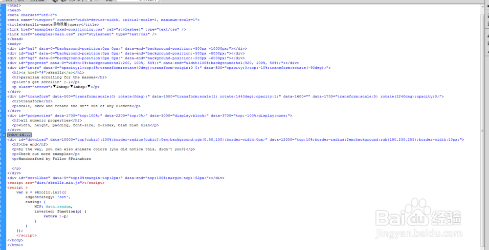
skrollr-maste滚动视差jquery
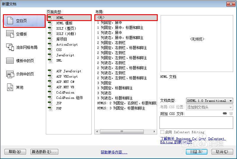
1、新建html文档。
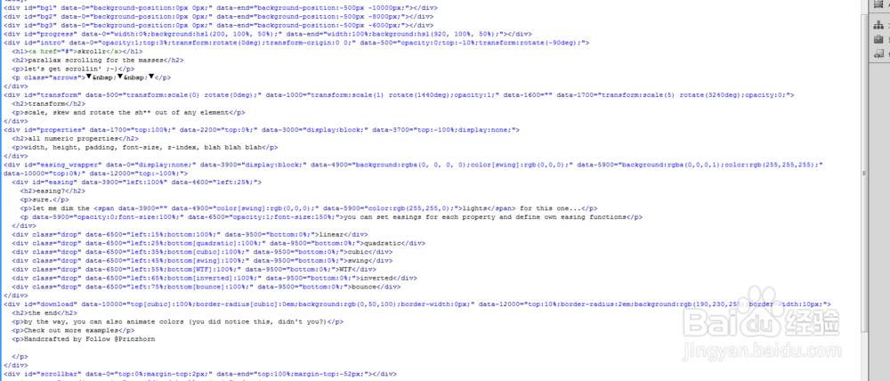
2、书写hmtl代码。
<div id="bg1" data-0="background-position:0px 0px;" data-end="background-position:-500px -10000px;"></div>
<div id="bg2" data-0="background-position:0px 0px;" data-end="background-position:-500px -8000px;"></div>
<div id="bg3" data-0="background-position:0px 0px;" data-end="background-position:-500px -6000px;"></div>
<div id="progress" data-0="width:0%;background:hsl(200, 100%, 50%);" data-end="width:100%;background:hsl(920, 100%, 50%);"></div>
<div id="intro" data-0="opacity:1;top:3%;transform:rotate(0deg);transform-origin:0 0;" data-500="opacity:0;top:-10%;transform:rotate(-90deg);">
<h1><a href="#">skrollr</a></h1>
<h2>parallax scrolling for the masses</h2>
let's get scrollin' ;-)
<p class="arrows">▼ ▼ ▼
</div>
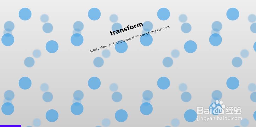
<div id="transform" data-500="transform:scale(0) rotate(0deg);" data-1000="transform:scale(1) rotate(1440deg);opacity:1;" data-1600="" data-1700="transform:scale(5) rotate(3240deg);opacity:0;">
<h2>transform</h2>
scale, skew and rotate the sh** out of any element
</div>
<div id="properties" data-1700="top:100%;" data-2200="top:0%;" data-3000="display:block;" data-3700="top:-100%;display:none;">
<h2>all numeric properties</h2>
width, height, padding, font-size, z-index, blah blah blah
</div>
<div id="easing_wrapper" data-0="display:none;" data-3900="display:block;" data-4900="background:rgba(0, 0, 0, 0);color[swing]:rgb(0,0,0);" data-5900="background:rgba(0,0,0,1);color:rgb(255,255,255);" data-10000="top:0%;" data-12000="top:-100%;">
<div id="easing" data-3900="left:100%" data-4600="left:25%;">
<h2>easing?</h2>
sure.
let me dim the <span data-3900="" data-4900="color[swing]:rgb(0,0,0);" data-5900="color:rgb(255,255,0);">lights</span> for this one...
<p data-5900="opacity:0;font-size:100%;" data-6500="opacity:1;font-size:150%;">you can set easings for each property and define own easing functions
</div>
<div class="drop" data-6500="left:15%;bottom:100%;" data-9500="bottom:0%;">linear</div>
<div class="drop" data-6500="left:25%;bottom[quadratic]:100%;" data-9500="bottom:0%;">quadratic</div>
<div class="drop" data-6500="left:35%;bottom[cubic]:100%;" data-9500="bottom:0%;">cubic</div>
<div class="drop" data-6500="left:45%;bottom[swing]:100%;" data-9500="bottom:0%;">swing</div>
<div class="drop" data-6500="left:55%;bottom[WTF]:100%;" data-9500="bottom:0%;">WTF</div>
<div class="drop" data-6500="left:65%;bottom[inverted]:100%;" data-9500="bottom:0%;">inverted</div>
<div class="drop" data-6500="left:75%;bottom[bounce]:100%;" data-9500="bottom:0%;">bounce</div>
</div>
<div id="download" data-10000="top[cubic]:100%;border-radius[cubic]:0em;background:rgb(0,50,100);border-width:0px;" data-12000="top:10%;border-radius:2em;background:rgb(190,230,255);border-width:10px;">
<h2>the end</h2>
by the way, you can also animate colors (you did notice this, didn't you?)
Check out more examples
Handcrafted by Follow @Prinzhorn
</div>
<div id="scrollbar" data-0="top:0%;margin-top:2px;" data-end="top:100%;margin-top:-52px;"></div>
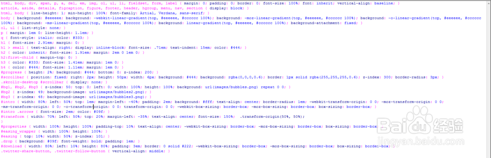
3、书写css代码。
html, body, div, span, p, a, del, em, img, ol, ul, li, fieldset, form, label { margin: 0; padding: 0; border: 0; font-size: 100%; font: inherit; vertical-align: baseline; }
article, aside, details, figcaption, figure, footer, header, hgroup, menu, nav, section { display: block; }
html, body { line-height: 1; min-height: 100%; font-family: Artial, Verdana, sans-serif; }
body { background: #eeeeee; background: -web kit-linear-gradient(top, #eeeeee, #cccccc 100%); background: -moz-linear-gradient(top, #eeeeee, #cccccc 100%); background: -o-linear-gradient(top, #eeeeee, #cccccc 100%); background: -ms-linear-gradient(top, #eeeeee, #cccccc 100%); background: linear-gradient(top, #eeeeee, #cccccc 100%); background-attachment: fixed; }
ol, ul { list-style: none; }
p { margin: 1em 0; line-height: 1.1em; }
q { font-style: italic; color: #333; }
h1 { font-size: 2.91em; margin: 0; }
h1 > small { text-align: right; display: inline-block; font-size: .71em; text-indent: 15em; color: #444; }
h2 { color: inherit; font-size: 1.91em; margin: 2em 0 1em 0; }
h2:first-child { margin-top: 0; }
h3 { color: #333; font-size: 1.41em; margin: 1em 0; }
h4 { color: #444; font-size: 1.11em; margin: 1em 0; }
#progress { height: 2%; background: #444; bottom: 0; z-index: 200; }
#scrollbar { position: fixed; right: 2px; height: 50px; width: 6px; background: #444; background: rgba(0,0,0,0.6); border: 1px solid rgba(255,255,255,0.6); z-index: 300; border-radius: 3px; }
.skrollr-desktop #scrollbar { display: none; }
#bg1, #bg2, #bg3 { z-index: 50; top: 0; left: 0; width: 100%; height: 100%; background: url(images/bubbles.png) repeat 0 0; }
#bg2 { z-index: 49; background-image: url(images/bubbles2.png); }
#bg3 { z-index: 48; background-image: url(images/bubbles3.png); }
#intro { width: 80%; left: 50%; top: 1em; margin-left: -40%; padding: 2em; background: #fff; text-align: center; border-radius: 1em; -web kit-transform-origin: 0 0; -moz-transform-origin: 0 0; -ms-transform-origin: 0 0; -o-transform-origin: 0 0; transform-origin: 0 0; -web kit-box-sizing: border-box; -moz-box-sizing: border-box; box-sizing: border-box; }
#intro .arrows { font-size: 2em; color: #09f; }
#transform { width: 70%; left: 50%; top: 20%; margin-left: -35%; text-align: center; font-size: 150%; .transform-origin(50%, 50%);
}
#properties { width: 100%; height: 100%; padding-top: 10%; text-align: center; -web kit-box-sizing: border-box; -moz-box-sizing: border-box; box-sizing: border-box; }
#easing_wrapper { width: 100%; height: 100%; }
#easing { top: 10%; width: 50%; z-index: 101; }
.drop { background: #09f; font-weight: bold; padding: 1em; }
#download { width: 80%; left: 10%; height: 80%; padding: 3em; border: 0 solid #222; -web kit-box-sizing: border-box; -moz-box-sizing: border-box; box-sizing: border-box; }
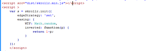
4、书写并添加js代码。
<script src="dist/skrollr.min.js"></script>
<script >
var s = skrollr.init({
edgeStrategy: 'set',
easing: {
WTF: Math.random,
inverted: function(p) {
return 1-p;
}
}
});
</script>
5、代码整体结构。
6、查看效果。