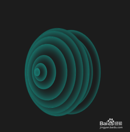
CSS3动感弹性波纹变换动画特效
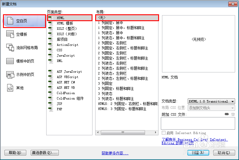
1、新建html文档。
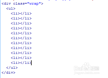
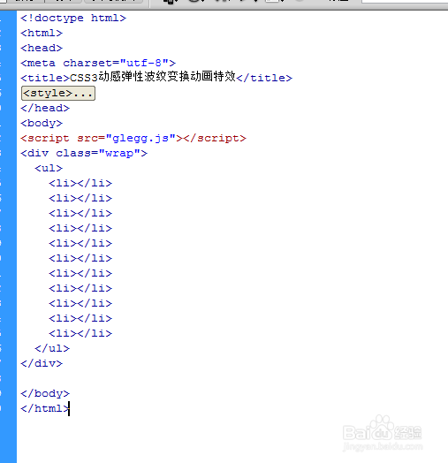
2、书写hmtl代码。
<div class="wrap">
<ul>
<li></li>
<li></li>
<li></li>
<li></li>
<li></li>
<li></li>
<li></li>
<li></li>
<li></li>
<li></li>
<li></li>
</ul>
</div>
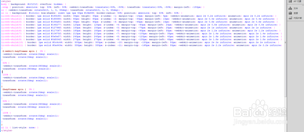
3、书写css代码。
<style>
body { background: #1C1C1C; overflow: hidden; }
.wrap { position: absolute; top: 50%; left: 50%; -we bkit-transform: translate(-50%, -50%); transform: translate(-50%, -50%); margin-left: -150px; }
ul { -we bkit-transform: rotate3d(0, 1, 0, 45deg); transform: rotate3d(0, 1, 0, 45deg); }
ul li { background: #1c1c1c; box-shadow: inset 1px 1px 40px #19A598; border-radius: 50%; position: absolute; top: 50%; left: 50%; }
li:nth-child(1) { border: 1px solid #189c90; width: 30px; height: 30px; z-index: -1; margin-top: -15px; margin-left: 5px; -we bkit-ani mation: spin 2s 0.2s infinite; ani mation: spin 2s 0.2s infinite; }
li:nth-child(2) { border: 1px solid #169388; width: 60px; height: 60px; z-index: -2; margin-top: -30px; margin-left: 10px; -we bkit-ani mation: spin 2s 0.4s infinite; ani mation: spin 2s 0.4s infinite; }
li:nth-child(3) { border: 1px solid #158a80; width: 90px; height: 90px; z-index: -3; margin-top: -45px; margin-left: 15px; -we bkit-ani mation: spin 2s 0.6s infinite; ani mation: spin 2s 0.6s infinite; }
li:nth-child(4) { border: 1px solid #148277; width: 120px; height: 120px; z-index: -4; margin-top: -60px; margin-left: 20px; -we bkit-ani mation: spin 2s 0.8s infinite; ani mation: spin 2s 0.8s infinite; }
li:nth-child(5) { border: 1px solid #12796f; width: 150px; height: 150px; z-index: -5; margin-top: -75px; margin-left: 25px; -we bkit-ani mation: spin 2s 1s infinite; ani mation: spin 2s 1s infinite; }
li:nth-child(6) { border: 1px solid #117067; width: 180px; height: 180px; z-index: -6; margin-top: -90px; margin-left: 30px; -we bkit-ani mation: spin 2s 1.2s infinite; ani mation: spin 2s 1.2s infinite; }
li:nth-child(7) { border: 1px solid #10675f; width: 210px; height: 210px; z-index: -7; margin-top: -105px; margin-left: 35px; -we bkit-ani mation: spin 2s 1.4s infinite; ani mation: spin 2s 1.4s infinite; }
li:nth-child(8) { border: 1px solid #0e5e57; width: 240px; height: 240px; z-index: -8; margin-top: -120px; margin-left: 40px; -we bkit-ani mation: spin 2s 1.6s infinite; ani mation: spin 2s 1.6s infinite; }
li:nth-child(9) { border: 1px solid #0d554f; width: 270px; height: 270px; z-index: -9; margin-top: -135px; margin-left: 45px; -we bkit-ani mation: spin 2s 1.8s infinite; ani mation: spin 2s 1.8s infinite; }
li:nth-child(10) { border: 1px solid #0c4c46; width: 300px; height: 300px; z-index: -10; margin-top: -150px; margin-left: 50px; -we bkit-ani mation: spin 2s 2s infinite; ani mation: spin 2s 2s infinite; }
li:nth-child(11) { border: 1px solid #0a443e; width: 330px; height: 330px; z-index: -11; margin-top: -165px; margin-left: 55px; -we bkit-ani mation: spin 2s 2.2s infinite; ani mation: spin 2s 2.2s infinite; }
@-we bkit-keyframes spin { 0% {
-we bkit-transform: rotate(0deg) scale(1);
transform: rotate(0deg) scale(1);
}
50% {
-we bkit-transform: rotate(360deg) scale(2);
transform: rotate(360deg) scale(2);
}
100% {
-we bkit-transform: rotate(0deg) scale(1);
transform: rotate(0deg) scale(1);
}
}
@keyframes spin { 0% {
-we bkit-transform: rotate(0deg) scale(1);
transform: rotate(0deg) scale(1);
}
50% {
-we bkit-transform: rotate(360deg) scale(2);
transform: rotate(360deg) scale(2);
}
100% {
-we bkit-transform: rotate(0deg) scale(1);
transform: rotate(0deg) scale(1);
}
}
ul li { list-style: none; }
</style>
4、书写并添加js代码。<script src="glegg.js"></script>

5、代码整体结构。
6、查看效果。