静态html页面如何兼容pc和移动端
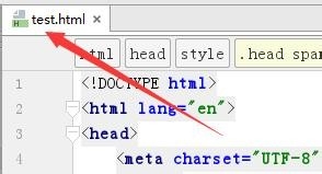
1、在电脑桌面上,选择【JetBrains PhpStorm 2016.3.2】进入。

2、在“PhpStorm 2016.3.2”中,打开一个html文件【test.html】。
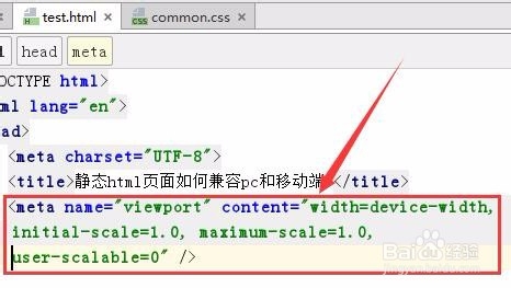
3、在“test.html”文件中的head之间,录入如下代码:
<meta name="viewport" content="width=device-width, initial-scale=1.0, maximum-scale=1.0, user-scalable=0" />
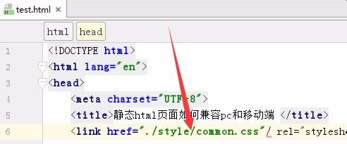
4、在文件“test.html”中,引入一个css文件【common.css】。
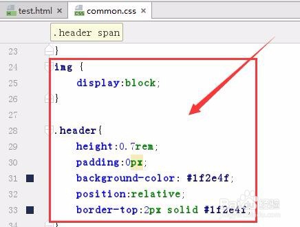
5、在common.css文件中前面部分,书写pc端的css代码。
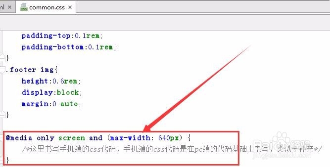
6、在common.css文件中的最底部,书写手机端的css代码,代码使用如何代码包括起来。
@media only screen and (max-width: 640px) {
/*这里书写手机端的css代码,手机端的css代码是在pc端的代码基础上书写,类似于补充*/
}
1、打开一个html测试文件。
2、在html文件中的head之间,录入代码:<meta name="viewport" content="width=device-width, initial-scale=1.0, maximum-scale=1.0, user-scalable=0" />
3、在html文件中引入一个common.css文件。
4、在common.css中分别书写电脑端的css代码和手机端的css代码,电脑端代码在手机端代码的前面。
声明:本网站引用、摘录或转载内容仅供网站访问者交流或参考,不代表本站立场,如存在版权或非法内容,请联系站长删除,联系邮箱:site.kefu@qq.com。
阅读量:161
阅读量:102
阅读量:84
阅读量:62
阅读量:160