Bootstrap多功能自定义选项卡
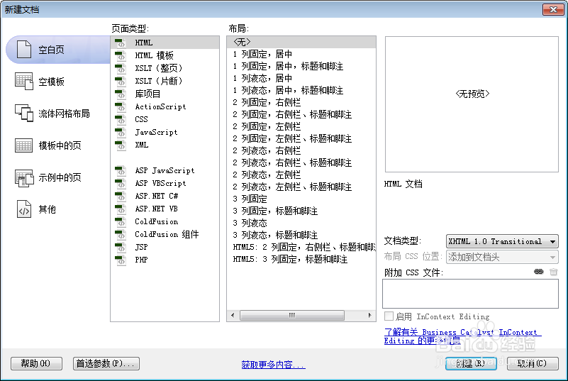
1、新建html文档。
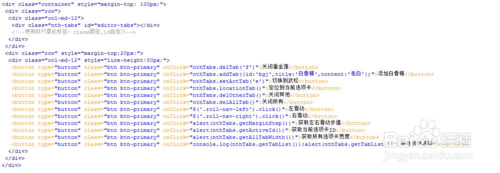
2、书写hmtl代码。
<div class="container" style="margin-top: 100px;">
<div class="row">
<div class="col-md-12">
<div class="nth-tabs" id="editor-tabs"></div>
<!--使用时只需此标签,class固定,id自定义-->
</div>
</div>
<div class="row" style="margin-top:20px;">
<div class="col-md-12" style="line-height:50px;">
<button type="button" class="btn btn-primary" onClick="nthTabs.delTab('f')">关闭潘金莲</button>
<button type="button" class="btn btn-primary" onClick="nthTabs.addTab({id:'bgj',title:'白骨精',content:'老白'})">添加白骨精</button>
<button type="button" class="btn btn-primary" onClick="nthTabs.setActTab('e')">切换到武松</button>
<button type="button" class="btn btn-primary" onClick="nthTabs.locationTab()">定位到当前选项卡</button>
<button type="button" class="btn btn-primary" onClick="nthTabs.delOtherTab()">关闭其他</button>
<button type="button" class="btn btn-primary" onClick="nthTabs.delAllTab()">关闭所有</button>
<button type="button" class="btn btn-primary" onClick="$('.roll-nav-left').click()">左滑动</button>
<button type="button" class="btn btn-primary" onClick="$('.roll-nav-right').click()">右滑动</button>
<button type="button" class="btn btn-primary" onClick="alert(nthTabs.getMarginStep())">获取左右滑动步值</button>
<button type="button" class="btn btn-primary" onClick="alert(nthTabs.getActiveId())">获取当前选项卡ID</button>
<button type="button" class="btn btn-primary" onClick="alert(nthTabs.getAllTabWidth())">获取所有选项卡宽度</button>
<button type="button" class="btn btn-primary" onClick="console.log(nthTabs.getTabList());alert(nthTabs.getTabList())">获取所有选项卡</button>
</div>
</div>
</div>
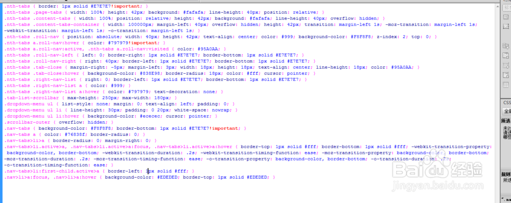
3、书写css代码。
.nth-tabs { border: 1px solid #E7E7E7!important; }
.nth-tabs .page-tabs { width: 100%; height: 42px; background: #fafafa; line-height: 40px; position: relative; }
.nth-tabs .content-tabs { width: 100%; position: relative; height: 42px; background: #fafafa; line-height: 40px; overflow: hidden; }
.nth-tabs .content-tabs-container { width: 100000px; margin-left: 40px; overflow: hidden; height: 42px; transition: margin-left 1s; -moz-transition: margin-left 1s; -webkit-transition: margin-left 1s; -o-transition: margin-left 1s; }
.nth-tabs .roll-nav { position: absolute; width: 40px; height: 42px; text-align: center; color: #999; background-color: #F8F8F8; z-index: 2; top: 0; }
.nth-tabs a.roll-nav:hover { color: #797979!important; }
.nth-tabs a.roll-nav:active, .nth-tabs a.roll-nav:visited { color: #95A0AA; }
.nth-tabs .roll-nav-left { left: 0; border-right: 1px solid #E7E7E7; border-bottom: 1px solid #E7E7E7; }
.nth-tabs .roll-nav-right { right: 40px; border-left: 1px solid #E7E7E7; border-bottom: 1px solid #E7E7E7; }
.nth-tabs .tab-close { margin-right: -5px; margin-left: 3px; width: 18px; height: 18px; text-align: center; line-height: 18px; color: #95A0AA; }
.nth-tabs .tab-close:hover { background-color: #838E98; border-radius: 18px; color: #fff; cursor: pointer; }
.nth-tabs .right-nav-list { right: 0; border-left: 1px solid #E7E7E7; border-bottom: 1px solid #E7E7E7; }
.nth-tabs .right-nav-list a { color: #999; }
.nth-tabs .right-nav-list a:hover { color: #797979; text-decoration: none; }
.tab-list-scrollbar { max-height: 250px; max-width: 180px; }
.dropdown-menu ul { list-style: none; margin: 0; text-align: left; padding: 0; }
.dropdown-menu ul li { line-height: 30px; padding: 0 20px; white-space: nowrap; }
.dropdown-menu ul li:hover { background-color: #ececec; cursor: pointer; }
.scrollbar-outer { overflow: hidden; }
.nav-tabs { background-color: #F8F8F8; border-bottom: 1px solid #E7E7E7!important; }
.nav-tabs a { color: #76838f; border-radius: 0; }
.nav-tabs>li>a { border-radius: 0; margin-right: 0; }
.nav-tabs>li.active>a, .nav-tabs>li.active>a:focus, .nav-tabs>li.active>a:hover { border-top: 1px solid #fff; border-bottom: 1px solid #fff; -webkit-transition-property: background-color, border-bottom; -webkit-transition-duration: .2s; -webkit-transition-timing-function: ease; -moz-transition-property: background-color, border-bottom; -moz-transition-duration: .2s; -moz-transition-timing-function: ease; -o-transition-property: background-color, border-bottom; -o-transition-duration: .2s; -o-transition-timing-function: ease; }
.nav-tabs>li:first-child.active>a { border-left: 1px solid #fff; }
.nav>li>a:focus, .nav>li>a:hover { background-color: #EDEDED; border-top: 1px solid #EDEDED; }
4、书写并添加js代码。
<script src="js/jquery.min.js"></script>
<script src="js/bootstrap.min.js"></script>
<script src="js/jquery.scrollbar.min.js"></script>
<script src="js/nth.tabs.min.js"></script>

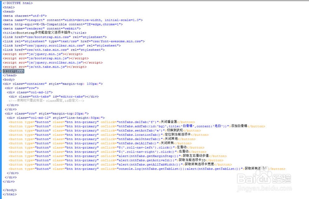
5、代码整体结构。
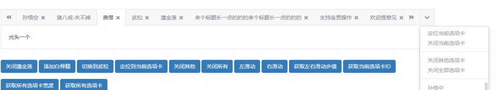
6、查看效果。