css3鼠标悬停按钮滑动切换动画
1、新建html文档。

2、准备好需要用到的字体图标。

3、书写hmtl代码。
<div class="container_even">
<div class="set_container">
<div class="set_2_button color1 set_2_btn-1 icon-forward"><span>Sample Button</span></div>
<!--End of Button 1 -->
<div class="set_2_button color2 set_2_btn-1 icon-backward"><span>Sample Button</span></div>
<!--End of Button 2 -->
<div class="set_2_button color3 set_2_btn-2 icon-up"><span>Sample Button</span></div>
<!--End of Button 3 -->
<div class="set_2_button color4 set_2_btn-2 icon-down"><span>Sample Button</span></div>
<!--End of Button 4 -->
<div class="set_2_button color5 set_2_btn-2 icon-down"><span>Sample Button</span></div>
<!--End of Button 5 -->
<div style="clear:both"></div>
</div>
</div>

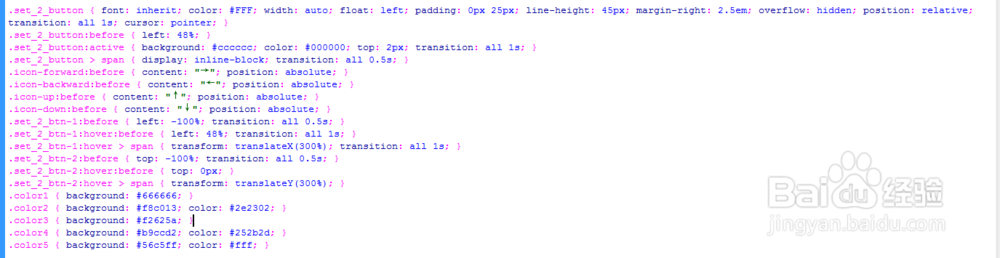
4、书写css代码。
.set_2_button { font: inherit; color: #FFF; width: auto; float: left; padding: 0px 25px; line-height: 45px; margin-right: 2.5em; overflow: hidden; position: relative; transition: all 1s; cursor: pointer; }
.set_2_button:before { left: 48%; }
.set_2_button:active { background: #cccccc; color: #000000; top: 2px; transition: all 1s; }
.set_2_button > span { display: inline-block; transition: all 0.5s; }
.icon-forward:before { content: "→"; position: absolute; }
.icon-backward:before { content: "←"; position: absolute; }
.icon-up:before { content: "↑"; position: absolute; }
.icon-down:before { content: "↓"; position: absolute; }
.set_2_btn-1:before { left: -100%; transition: all 0.5s; }
.set_2_btn-1:hover:before { left: 48%; transition: all 1s; }
.set_2_btn-1:hover > span { transform: translateX(300%); transition: all 1s; }
.set_2_btn-2:before { top: -100%; transition: all 0.5s; }
.set_2_btn-2:hover:before { top: 0px; }
.set_2_btn-2:hover > span { transform: translateY(300%); }
.color1 { background: #666666; }
.color2 { background: #f8c013; color: #2e2302; }
.color3 { background: #f2625a; }
.color4 { background: #b9ccd2; color: #252b2d; }
.color5 { background: #56c5ff; color: #fff; }
5、代码整体结构。

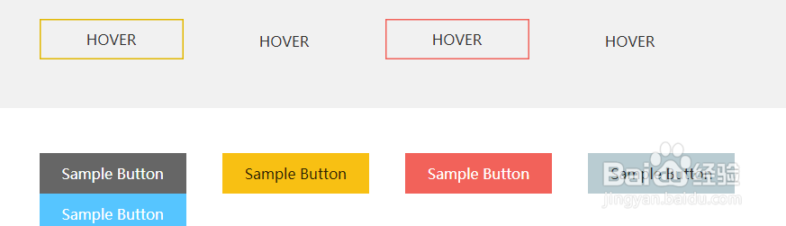
6、查看效果。