html5+CSS3实现水波浪浮动
1、准备水波浪素材。


2、新建html文档。

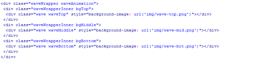
3、书写hmtl代码。
<div class="waveWrapper waveAnimation">
<div class="waveWrapperInner bgTop">
<div class="wave waveTop" style="background-image: url('img/wave-top.png')"></div>
</div>
<div class="waveWrapperInner bgMiddle">
<div class="wave waveMiddle" style="background-image: url('img/wave-mid.png')"></div>
</div>
<div class="waveWrapperInner bgBottom">
<div class="wave waveBottom" style="background-image: url('img/wave-bot.png')"></div>
</div>
</div>
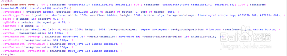
4、书写css代码。
<style>
@keyframes move_wave { 0% { transform: translateX(0) translateZ(0) scaleY(1)} 50% { transform: translateX(-25%) translateZ(0) scaleY(0.55)} 100% { transform: translateX(-50%) translateZ(0) scaleY(1)}}
.waveWrapper { overflow: hidden; position: absolute; left: 0; right: 0; bottom: 0; top: 0; margin: auto; }
.waveWrapperInner { position: absolute; width: 100%; overflow: hidden; height: 100%; bottom: -1px; background-image: linear-gradient(to top, #86377b 20%, #27273c 80%); }
.bgTop { z-index: 15; opacity: 0.5; }
.bgMiddle { z-index: 10; opacity: 0.75; }
.bgBottom { z-index: 5; }
.wave { position: absolute; left: 0; width: 200%; height: 100%; background-repeat: repeat no-repeat; background-position: 0 bottom; transform-origin: center bottom; }
.waveTop { background-size: 50% 100px; }
.waveAnimation .waveTop { animation: move-wave 3s; -webkit-animation: move-wave 3s; -webkit-animation-delay: 1s; animation-delay: 1s; }
.waveMiddle { background-size: 50% 120px; }
.waveAnimation .waveMiddle { animation: move_wave 10s linear infinite; }
.waveBottom { background-size: 50% 100px; }
.waveAnimation .waveBottom { animation: move_wave 15s linear infinite; }
</style>
5、页面代码整体结构。

6、查看效果。