js特效加减乘除计算器代码
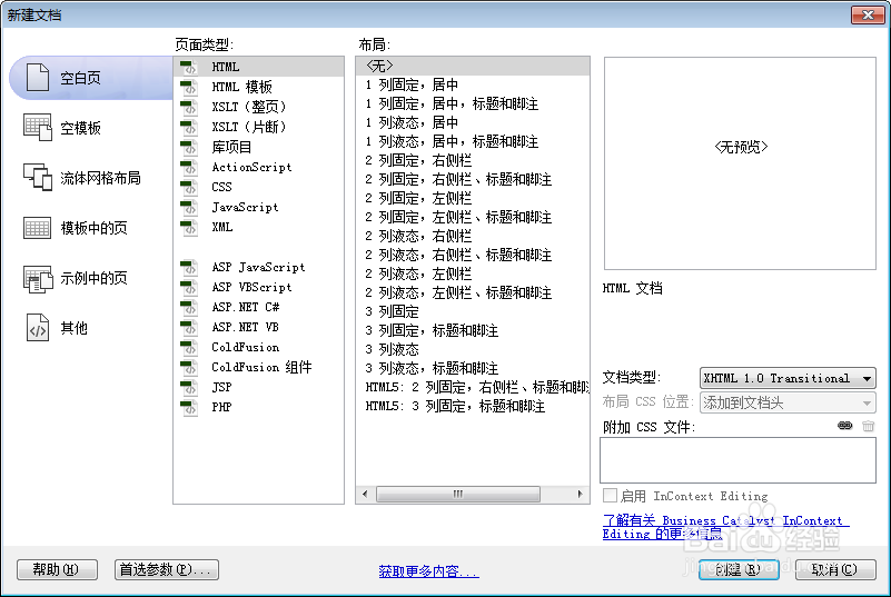
1、新建html。
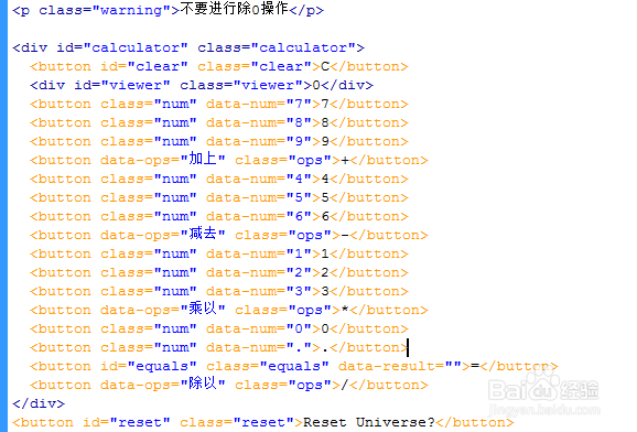
2、书写html。
<p class="warning">不要进行除0操作
<div id="calculator" class="calculator">
<button id="clear" class="clear">C</button>
<div id="viewer" class="viewer">0</div>
<button class="num" data-num="7">7</button>
<button class="num" data-num="8">8</button>
<button class="num" data-num="9">9</button>
<button data-ops="加上" class="ops">+</button>
<button class="num" data-num="4">4</button>
<button class="num" data-num="5">5</button>
<button class="num" data-num="6">6</button>
<button data-ops="减去" class="ops">-</button>
<button class="num" data-num="1">1</button>
<button class="num" data-num="2">2</button>
<button class="num" data-num="3">3</button>
<button data-ops="乘以" class="ops">*</button>
<button class="num" data-num="0">0</button>
<button class="num" data-num=".">.</button>
<button id="equals" class="equals" data-result="">=</button>
<button data-ops="除以" class="ops">/</button>
</div>
<button id="reset" class="reset">Reset Universe?</button>
3、新建css文件,并添加引用。
<link rel="stylesheet" type="text/css" href="css/normalize.css" />
<link rel="stylesheet" href="css/style.css">

4、书写normalize.css。
article, aside, details, figcaption, figure, footer, header, hgroup, main, nav, section, summary { display: block; }
audio, canvas, video { display: inline-block; }
audio:not([controls]) { display: none; height: 0; }
[hidden] {
display:none;
}
html { font-family: sans-serif; -ms-text-size-adjust: 100%; -webkit-text-size-adjust: 100%; }
body { margin: 0; }
a:focus { outline: thin dotted; }
a:active, a:hover { outline: 0; }
h1 { font-size: 2em; margin: 0.67em 0; }
abbr[title] { border-bottom: 1px dotted; }
b, strong { font-weight: bold; }
dfn { font-style: italic; }
hr { -moz-box-sizing: content-box; box-sizing: content-box; height: 0; }
mark { background: #ff0; color: #000; }
code, kbd, pre, samp { font-family: monospace, serif; font-size: 1em; }
pre { white-space: pre-wrap; }
q { quotes: "\201C" "\201D" "\2018" "\2019"; }
small { font-size: 80%; }
sub, sup { font-size: 75%; line-height: 0; position: relative; vertical-align: baseline; }
sup { top: -0.5em; }
sub { bottom: -0.25em; }
img { border: 0; }
svg:not(:root) { overflow: hidden; }
figure { margin: 0; }
fieldset { border: 1px solid #c0c0c0; margin: 0 2px; padding: 0.35em 0.625em 0.75em; }
legend { border: 0; padding: 0; }
button, input, select, textarea { font-family: inherit; font-size: 100%; margin: 0; }
button, input { line-height: normal; }
button, select { text-transform: none; }
button, html input[type="button"], input[type="reset"], input[type="submit"] { -webkit-appearance: button; cursor: pointer; }
button[disabled], html input[disabled] { cursor: default; }
input[type="checkbox"], input[type="radio"] { box-sizing: border-box; padding: 0; }
input[type="search"] { -webkit-appearance: textfield; -moz-box-sizing: content-box; -webkit-box-sizing: content-box; box-sizing: content-box; }
input[type="search"]::-webkit-search-cancel-button, input[type="search"]::-webkit-search-decoration {
-webkit-appearance:none;
}
button::-moz-focus-inner, input::-moz-focus-inner {
border:0;
padding:0;
}
textarea { overflow: auto; vertical-align: top; }
table { border-collapse: collapse; border-spacing: 0; }

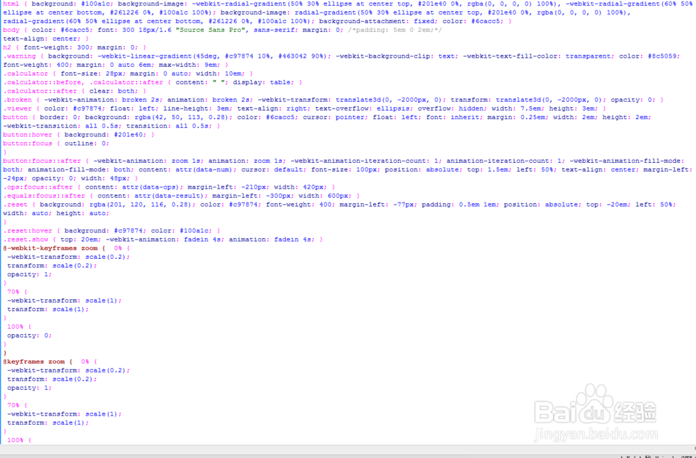
5、书写style.css。
html { background: #100a1c; background-image: -webkit-radial-gradient(50% 30% ellipse at center top, #201e40 0%, rgba(0, 0, 0, 0) 100%), -webkit-radial-gradient(60% 50% ellipse at center bottom, #261226 0%, #100a1c 100%); background-image: radial-gradient(50% 30% ellipse at center top, #201e40 0%, rgba(0, 0, 0, 0) 100%), radial-gradient(60% 50% ellipse at center bottom, #261226 0%, #100a1c 100%); background-attachment: fixed; color: #6cacc5; }
body { color: #6cacc5; font: 300 18px/1.6 "Source Sans Pro", sans-serif; margin: 0; /*padding: 5em 0 2em;*/
text-align: center; }
h2 { font-weight: 300; margin: 0; }
.warning { background: -webkit-linear-gradient(45deg, #c97874 10%, #463042 90%); -webkit-background-clip: text; -webkit-text-fill-color: transparent; color: #8c5059; font-weight: 400; margin: 0 auto 6em; max-width: 9em; }
.calculator { font-size: 28px; margin: 0 auto; width: 10em; }
.calculator::before, .calculator::after { content: " "; display: table; }
.calculator::after { clear: both; }
.broken { -webkit-animation: broken 2s; animation: broken 2s; -webkit-transform: translate3d(0, -2000px, 0); transform: translate3d(0, -2000px, 0); opacity: 0; }
.viewer { color: #c97874; float: left; line-height: 3em; text-align: right; text-overflow: ellipsis; overflow: hidden; width: 7.5em; height: 3em; }
button { border: 0; background: rgba(42, 50, 113, 0.28); color: #6cacc5; cursor: pointer; float: left; font: inherit; margin: 0.25em; width: 2em; height: 2em; -webkit-transition: all 0.5s; transition: all 0.5s; }
button:hover { background: #201e40; }
button:focus { outline: 0;
}
button:focus::after { -webkit-animation: zoom 1s; animation: zoom 1s; -webkit-animation-iteration-count: 1; animation-iteration-count: 1; -webkit-animation-fill-mode: both; animation-fill-mode: both; content: attr(data-num); cursor: default; font-size: 100px; position: absolute; top: 1.5em; left: 50%; text-align: center; margin-left: -24px; opacity: 0; width: 48px; }
.ops:focus::after { content: attr(data-ops); margin-left: -210px; width: 420px; }
.equals:focus::after { content: attr(data-result); margin-left: -300px; width: 600px; }
.reset { background: rgba(201, 120, 116, 0.28); color: #c97874; font-weight: 400; margin-left: -77px; padding: 0.5em 1em; position: absolute; top: -20em; left: 50%; width: auto; height: auto;
}
.reset:hover { background: #c97874; color: #100a1c; }
.reset.show { top: 20em; -webkit-animation: fadein 4s; animation: fadein 4s; }
@-webkit-keyframes zoom { 0% {
-webkit-transform: scale(0.2);
transform: scale(0.2);
opacity: 1;
}
70% {
-webkit-transform: scale(1);
transform: scale(1);
}
100% {
opacity: 0;
}
}
@keyframes zoom { 0% {
-webkit-transform: scale(0.2);
transform: scale(0.2);
opacity: 1;
}
70% {
-webkit-transform: scale(1);
transform: scale(1);
}
100% {
opacity: 0;
}
}
@-webkit-keyframes broken { 0% {
-webkit-transform: translate3d(0, 0, 0);
transform: translate3d(0, 0, 0);
opacity: 1;
}
5% {
-webkit-transform: rotate(5deg);
transform: rotate(5deg);
}
15% {
-webkit-transform: rotate(-5deg);
transform: rotate(-5deg);
}
20% {
-webkit-transform: rotate(5deg);
transform: rotate(5deg);
}
25% {
-webkit-transform: rotate(-5deg);
transform: rotate(-5deg);
}
50% {
-webkit-transform: rotate(45deg);
transform: rotate(45deg);
}
70% {
-webkit-transform: translate3d(0, 2000px, 0);
transform: translate3d(0, 2000px, 0);
opacity: 1;
}
75% {
opacity: 0;
}
100% {
-webkit-transform: translate3d(0, -2000px, 0);
transform: translate3d(0, -2000px, 0);
}
}
@keyframes broken { 0% {
-webkit-transform: translate3d(0, 0, 0);
transform: translate3d(0, 0, 0);
opacity: 1;
}
5% {
-webkit-transform: rotate(5deg);
transform: rotate(5deg);
}
15% {
-webkit-transform: rotate(-5deg);
transform: rotate(-5deg);
}
20% {
-webkit-transform: rotate(5deg);
transform: rotate(5deg);
}
25% {
-webkit-transform: rotate(-5deg);
transform: rotate(-5deg);
}
50% {
-webkit-transform: rotate(45deg);
transform: rotate(45deg);
}
70% {
-webkit-transform: translate3d(0, 2000px, 0);
transform: translate3d(0, 2000px, 0);
opacity: 1;
}
75% {
opacity: 0;
}
100% {
-webkit-transform: translate3d(0, -2000px, 0);
transform: translate3d(0, -2000px, 0);
}
}
/* Reset button fadein */
@-webkit-keyframes fadein { 0% {
top: 20em;
opacity: 0;
}
50% {
opacity: 0;
}
100% {
opacity: 1;
}
}
@keyframes fadein { 0% {
top: 20em;
opacity: 0;
}
50% {
opacity: 0;
}
100% {
opacity: 1;
}
}
@media (min-width: 420px) {
.calculator { width: 12em; }
.viewer { width: 8.5em; }
button { margin: 0.5em; }
}