CSS3文字阴影实现乳白文字效果
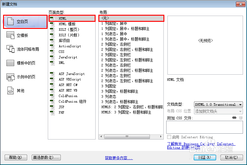
1、新建html文档。
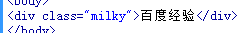
2、书写hmtl代码。<div class="milky">百度经验</div>
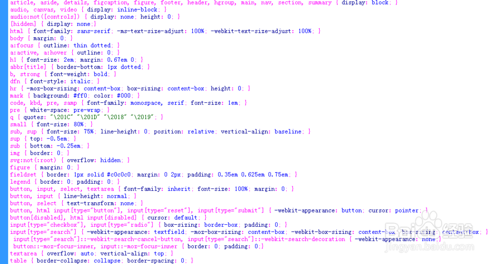
3、初始化css代码。
<style>
article, aside, details, figcaption, figure, footer, header, hgroup, main, nav, section, summary { display: block; }
audio, canvas, video { display: inline-block; }
audio:not([controls]) { display: none; height: 0; }
[hidden] { display: none;}
html { font-family: sans-serif; -ms-text-size-adjust: 100%; -webkit-text-size-adjust: 100%; }
body { margin: 0; }
a:focus { outline: thin dotted; }
a:active, a:hover { outline: 0; }
h1 { font-size: 2em; margin: 0.67em 0; }
abbr[title] { border-bottom: 1px dotted; }
b, strong { font-weight: bold; }
dfn { font-style: italic; }
hr { -moz-box-sizing: content-box; box-sizing: content-box; height: 0; }
mark { background: #ff0; color: #000; }
code, kbd, pre, samp { font-family: monospace, serif; font-size: 1em; }
pre { white-space: pre-wrap; }
q { quotes: "\201C" "\201D" "\2018" "\2019"; }
small { font-size: 80%; }
sub, sup { font-size: 75%; line-height: 0; position: relative; vertical-align: baseline; }
sup { top: -0.5em; }
sub { bottom: -0.25em; }
img { border: 0; }
svg:not(:root) { overflow: hidden; }
figure { margin: 0; }
fieldset { border: 1px solid #c0c0c0; margin: 0 2px; padding: 0.35em 0.625em 0.75em; }
legend { border: 0; padding: 0; }
button, input, select, textarea { font-family: inherit; font-size: 100%; margin: 0; }
button, input { line-height: normal; }
button, select { text-transform: none; }
button, html input[type="button"], input[type="reset"], input[type="submit"] { -webkit-appearance: button; cursor: pointer; }
button[disabled], html input[disabled] { cursor: default; }
input[type="checkbox"], input[type="radio"] { box-sizing: border-box; padding: 0; }
input[type="search"] { -webkit-appearance: textfield; -moz-box-sizing: content-box; -webkit-box-sizing: content-box; box-sizing: content-box; }
input[type="search"]::-webkit-search-cancel-button, input[type="search"]::-webkit-search-decoration { -webkit-appearance: none;}
button::-moz-focus-inner, input::-moz-focus-inner { border: 0; padding: 0;}
textarea { overflow: auto; vertical-align: top; }
table { border-collapse: collapse; border-spacing: 0; }
</style>
4、书写css代码。.milky { font-family: "Arial Rounded MT Bold", "Helvetica Rounded", Arial, sans-serif; text-transform: uppercase; display: block; font-size: 92px; color: #f1ebe5; text-shadow: 0 8px 9px #c4b59d, 0px -2px 1px #fff; font-weight: bold; letter-spacing: -4px; text-align: center; background: linear-gradient(to bottom, #ece4d9 0%,#e9dfd1 100%); position: absolute; padding: 100px 200px; top: 30%; left: 50%; transform: translate(-50%,-50%); border-radius: 20px;}

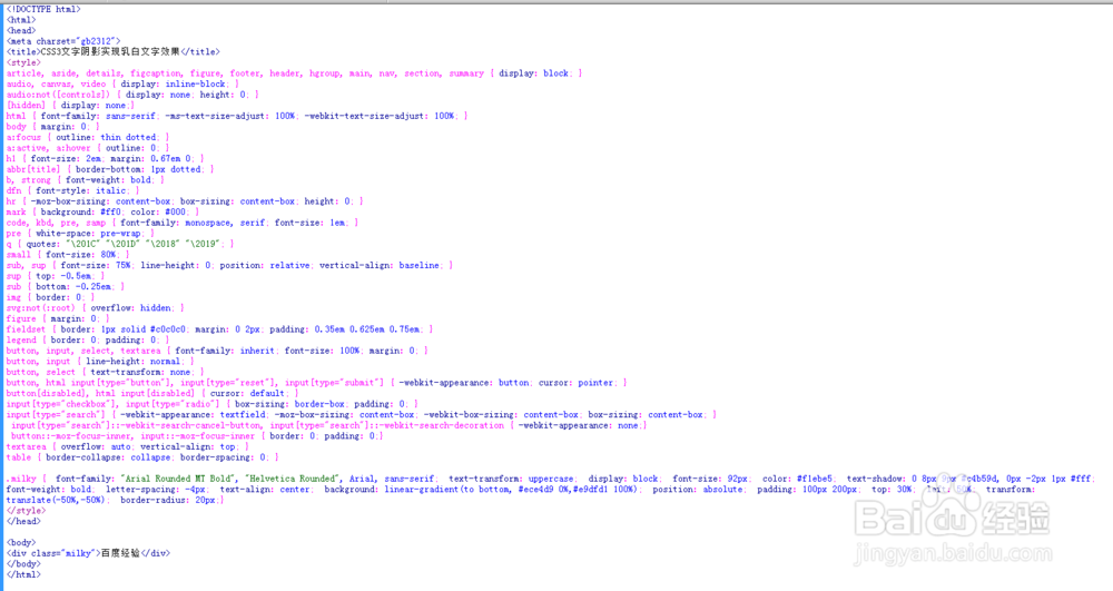
5、代码整体结构。
6、查看效果。