html+css3+jQuery实现左右切换特效
1、新建html文档。

2、书写hmtl代码。
<div class="container">
<div class="card-container-2">
<div class="controller right"></div>
<div class="controller left"></div>
<div class="card-holder">
<div class="card">
<h1>1</h1>
</div>
<div class="card">
<h1>2</h1>
</div>
<div class="card">
<h1>3</h1>
</div>
</div>
</div>
</div>

3、初始化css代码。
<style>
html,body,div,span,applet,object,iframe,h1,h2,h3,h4,h5,h6,p,blockquote,pre,a,abbr,acronym,address,big,cite,code,del,dfn,em,img,ins,kbd,q,s,samp,small,strike,strong,sub,sup,tt,var,b,u,i,center,dl,dt,dd,ol,ul,li,fieldset,form,label,legend,table,caption,tbody,tfoot,thead,tr,th,td,article,aside,canvas,details,embed,figure,figcaption,footer,header,hgroup,menu,nav,output,ruby,section,summary,time,mark,audio,video{margin:0;padding:0;border:0;font-size:100%;font:inherit;vertical-align:baseline}article,aside,details,figcaption,figure,footer,header,hgroup,menu,nav,section{display:block}body{line-height:1}ol,ul{list-style:none}blockquote,q{quotes:none}blockquote:before,blockquote:after,q:before,q:after{content:'';content:none}table{border-collapse:collapse;border-spacing:0}
</style>

4、书写css代码。
<style>
body { background: #000; font-family: 'avenir Next', 'sans-serif'; width: 100%; }
.container { position: relative; -webkit-transition: all .3s ease; transition: all .3s ease; padding: 40px 0; }
div[class*='card-container-'] { position: relative; margin: 40px auto; width: 200px; height: 200px; -webkit-perspective: 500px; perspective: 500px; }
.card h1 { font-size: 2em; font-weight: 600; padding: 1em 0 0 1em; }
.card-container-2 { cursor: pointer; cursor: hand; color: #ff887b; }
.card-container-2 .controller { position: absolute; z-index: 200; top: 0; width: 50%; height: 100%; background: none; }
.card-container-2 .controller.left { left: 0; }
.card-container-2 .controller.right { right: 0; }
.card-container-2 .card { position: absolute; left: 0; top: 0; width: 100%; height: 100%; -webkit-transition: all .3s ease; transition: all .3s ease; border-radius: 2px; background-color: mistyrose; box-shadow: 0 2px 8px 0 rgba(0, 0, 0, 0.2); z-index: 90; opacity: .9; }
.card-container-2 .card:first-of-type { z-index: 100; opacity: 1; }
.card-container-2 .card:nth-of-type(n+2) { -webkit-transform: scale(0.8); transform: scale(0.8); }
.card-container-2:hover .card:first-of-type { -webkit-transform: scale(0.9); transform: scale(0.9); -webkit-transform-origin: center; transform-origin: center; }
.card-container-2:hover .card:nth-last-of-type(2) { -webkit-transform: scale(0.8) rotate(-5deg) translateY(-20px); transform: scale(0.8) rotate(-5deg) translateY(-20px); -webkit-transform-origin: bottom left; transform-origin: bottom left; }
.card-container-2:hover .card:last-of-type { -webkit-transform: scale(0.8) rotate(5deg) translateY(-20px); transform: scale(0.8) rotate(5deg) translateY(-20px); -webkit-transform-origin: bottom right; transform-origin: bottom right; }
</style>

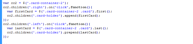
5、书写JS并引用。
<script src="js/jquery.min.js"></script>
<script>
var cc2 = $('.card-container-2');
cc2.children('.right').on('click',function(){
var firstCard = $('.card-container-2 .card').first();
cc2.children('.card-holder').append(firstCard);
});
cc2.children('.left').on('click',function(){
var lastCard = $('.card-container-2 .card').last();
cc2.children('.card-holder').prepend(lastCard);
});
</script>
6、查看效果
