html+css3+jQ文字周围星星闪烁特效
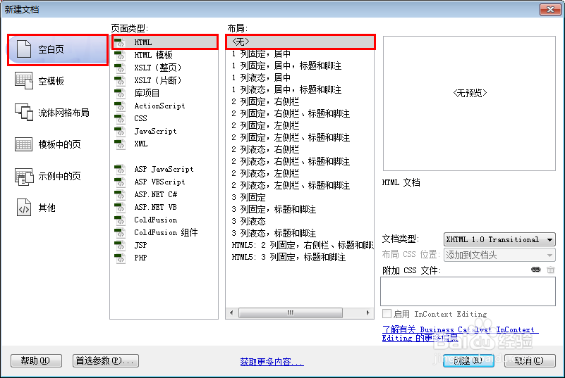
1、新建html文档。
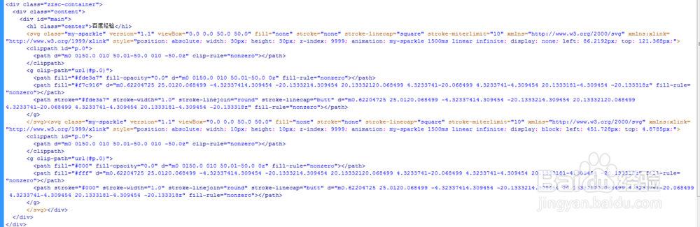
2、书写hmtl代码。
<div class="zzsc-container">
<div class="content">
<div id="main">
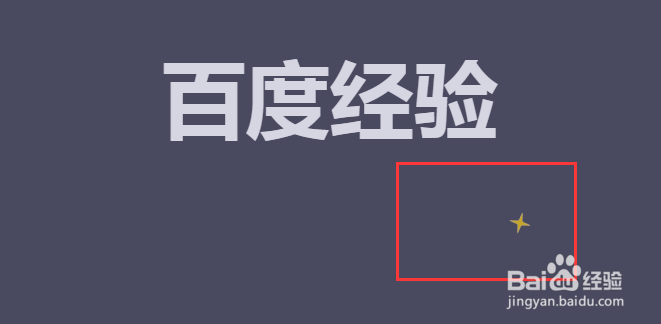
<h1 class="center">百度经验</h1>
<svg class="my-sparkle" version="1.1" viewBox="0.0 0.0 50.0 50.0" fill="none" stroke="none" stroke-linecap="square" stroke-miterlimit="10" style="position: absolute; width: 30px; height: 30px; z-index: 9999; animation: my-sparkle 1500ms linear infinite; display: none; left: 86.2192px; top: 121.368px;">
<clippath id="p.0">
<path d="m0 0l50.0 0l0 50.0l-50.0 0l0 -50.0z" clip-rule="nonzero"></path>
</clippath>
<g clip-path="url(#p.0)">
<path fill="#fde3a7" fill-opacity="0.0" d="m0 0l50.0 0l0 50.0l-50.0 0z" fill-rule="nonzero"></path>
<path fill="#f7c916" d="m0.62204725 25.0l20.068499 -4.323374l4.309454 -20.13332l4.309454 20.13332l20.068499 4.323374l-20.068499 4.323374l-4.309454 20.133318l-4.309454 -20.133318z" fill-rule="nonzero"></path>
<path stroke="#fde3a7" stroke-width="1.0" stroke-linejoin="round" stroke-linecap="butt" d="m0.62204725 25.0l20.068499 -4.323374l4.309454 -20.13332l4.309454 20.13332l20.068499 4.323374l-20.068499 4.323374l-4.309454 20.133318l-4.309454 -20.133318z" fill-rule="nonzero"></path>
</g>
</svg><svg class="my-sparkle" version="1.1" viewBox="0.0 0.0 50.0 50.0" fill="none" stroke="none" stroke-linecap="square" stroke-miterlimit="10" style="position: absolute; width: 10px; height: 10px; z-index: 9999; animation: my-sparkle 1500ms linear infinite; display: block; left: 451.728px; top: 4.8785px;">
<clippath id="p.0">
<path d="m0 0l50.0 0l0 50.0l-50.0 0l0 -50.0z" clip-rule="nonzero"></path>
</clippath>
<g clip-path="url(#p.0)">
<path fill="#000" fill-opacity="0.0" d="m0 0l50.0 0l0 50.0l-50.0 0z" fill-rule="nonzero"></path>
<path fill="#fff" d="m0.62204725 25.0l20.068499 -4.323374l4.309454 -20.13332l4.309454 20.13332l20.068499 4.323374l-20.068499 4.323374l-4.309454 20.133318l-4.309454 -20.133318z" fill-rule="nonzero"></path>
<path stroke="#000" stroke-width="1.0" stroke-linejoin="round" stroke-linecap="butt" d="m0.62204725 25.0l20.068499 -4.323374l4.309454 -20.13332l4.309454 20.13332l20.068499 4.323374l-20.068499 4.323374l-4.309454 20.133318l-4.309454 -20.133318z" fill-rule="nonzero"></path>
</g>
</svg></div>
</div>
</div>
3、书写css代码。
body { background: #494A5F; color: #D5D6E2; font-weight: 500; font-size: 1.05em; font-family: "Microsoft YaHei", "宋体", "Segoe UI", "Lucida Grande", Helvetica, Arial, sans-serif, FreeSans, Arimo; }
a { color: #2fa0ec; text-decoration: none; outline: none; }
a:hover, a:focus { color: #74777b; }
.zzsc-container { margin: 0 auto; }
.bgcolor-1 { background: #f0efee; }
.bgcolor-2 { background: #f9f9f9; }
.bgcolor-3 { background: #e8e8e8; }/*light grey*/
.bgcolor-4 { background: #2f3238; color: #fff; }/*Dark grey*/
.bgcolor-5 { background: #df6659; color: #521e18; }/*pink1*/
.bgcolor-6 { background: #2fa8ec; }/*sky blue*/
.bgcolor-7 { background: #d0d6d6; }/*White tea*/
.bgcolor-8 { background: #3d4444; color: #fff; }/*Dark grey2*/
.bgcolor-9 { background: #ef3f52; color: #fff; }/*pink2*/
.bgcolor-10 { background: #64448f; color: #fff; }/*Violet*/
.bgcolor-11 { background: #3755ad; color: #fff; }/*dark blue*/
.bgcolor-12 { background: #3498DB; color: #fff; }/*light blue*/
.bgcolor-20 { background: #494A5F; color: #D5D6E2; }
.zzsc-header { padding: 1em 190px 1em; letter-spacing: -1px; text-align: center; background: #66677c; }
.zzsc-header h1 { color: #D5D6E2; font-weight: 600; font-size: 2em; line-height: 1; margin-bottom: 0; font-family: "Microsoft YaHei", "宋体", "Segoe UI", "Lucida Grande", Helvetica, Arial, sans-serif, FreeSans, Arimo; }
.zzsc-header h1 span { font-family: "Microsoft YaHei", "宋体", "Segoe UI", "Lucida Grande", Helvetica, Arial, sans-serif, FreeSans, Arimo; display: block; font-size: 60%; font-weight: 400; padding: 0.8em 0 0.5em 0; color: #c3c8cd; }
.zzsc-demo a { color: #fff; text-decoration: none; }
.zzsc-demo { width: 100%; padding-bottom: 1.2em; }
.zzsc-demo a { display: inline-block; margin: 0.5em; padding: 0.6em 1em; border: 3px solid #fff; font-weight: 700; }
.zzsc-demo a:hover { opacity: 0.6; }
.zzsc-demo a.current { background: #1d7db1; color: #fff; }
/* Top Navigation Style */
.zzsc-links { position: relative; display: inline-block; white-space: nowrap; font-size: 1.5em; text-align: center; }
.zzsc-links::after { position: absolute; top: 0; left: 50%; margin-left: -1px; width: 2px; height: 100%; background: #dbdbdb; content: ''; -webkit-transform: rotate3d(0, 0, 1, 22.5deg); transform: rotate3d(0, 0, 1, 22.5deg); }
.zzsc-icon { display: inline-block; margin: 0.5em; padding: 0em 0; width: 1.5em; text-decoration: none; }
.zzsc-icon span { display: none; }
.zzsc-icon:before { margin: 0 5px; text-transform: none; font-weight: normal; font-style: normal; font-variant: normal; font-family: 'icomoon'; line-height: 1; speak: none; -webkit-font-smoothing: antialiased; }
/* footer */
.zzsc-footer { width: 100%; padding-top: 10px; }
.zzsc-small { font-size: 0.8em; }
.center { text-align: center; }
.content { width: 100%; height: 100%; position: relative; margin-top: 100px; }
#main { width: 500px; position: absolute; top: 50%; left: 50%; -webkit-transform: translate(-50%, -50%); -ms-transform: translate(-50%, -50%); -o-transform: translate(-50%, -50%); transform: translate(-50%, -50%); display: inline-block; font-size: 250%; font-weight: 500; }
.related { color: #fff; background: #494A5F; text-align: center; font-size: 1.25em; padding: 0.5em 0; overflow: hidden; }
.related > a { vertical-align: top; width: calc(100% - 20px); max-width: 340px; display: inline-block; text-align: center; margin: 20px 10px; padding: 25px; font-family: "Microsoft YaHei", "宋体", "Segoe UI", "Lucida Grande", Helvetica, Arial, sans-serif, FreeSans, Arimo; }
.related a { display: inline-block; text-align: left; margin: 20px auto; padding: 10px 20px; opacity: 0.8; -webkit-transition: opacity 0.3s; transition: opacity 0.3s; -webkit-backface-visibility: hidden; }
.related a:hover, .related a:active { opacity: 1; }
.related a img { max-width: 100%; opacity: 0.8; border-radius: 4px; }
.related a:hover img, .related a:active img { opacity: 1; }
.related h3 { font-family: "Microsoft YaHei", sans-serif; }
.related a h3 { font-weight: 300; margin-top: 0.15em; color: #fff; }
/* icomoon */
.icon-zzsc-home-outline:before { content: "\e5000"; }
.icon-zzsc-arrow-forward-outline:before { content: "\e5001"; }
@media screen and (max-width: 50em) {
.zzsc-header { padding: 3em 10% 4em; }
.zzsc-header h1 { font-size: 2em; }
}
@media screen and (max-width: 40em) {
.zzsc-header h1 { font-size: 1.5em; }
}
@media screen and (max-width: 30em) {
.zzsc-header h1 { font-size: 1.2em; }
}
@-moz-keyframes my-sparkle { 0% {
opacity: 0;
-moz-transform: rotate(0deg) scale(0);
}
50% {
opacity: 1;
-moz-transform: rotate(360deg) scale(1);
}
100% {
opacity: 0;
-moz-transform: rotate(720deg) scale(0);
}
}
@-webkit-keyframes my-sparkle { 0% {
opacity: 0;
-webkit-transform: rotate(0deg) scale(0);
}
50% {
opacity: 1;
-webkit-transform: rotate(360deg) scale(1);
}
100% {
opacity: 0;
-webkit-transform: rotate(720deg) scale(0);
}
}
@keyframes my-sparkle { 0% {
opacity: 0;
transform: rotate(0deg) scale(0);
}
50% {
opacity: 1;
transform: rotate(360deg) scale(1);
}
100% {
opacity: 0;
transform: rotate(720deg) scale(0);
}
}
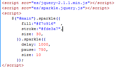
4、书写并添加js代码。
<script src="es/jquery-2.1.1.min.js"></script>
<script src="es/sparkle.jquery.js"></script>
<script>
$("#main").sparkle({
fill:"#f7c916",
stroke:"#fde3a7",
size: 30,
}).sparkle({
delay: 1000,
pause: 750,
size: 10
});
</script>
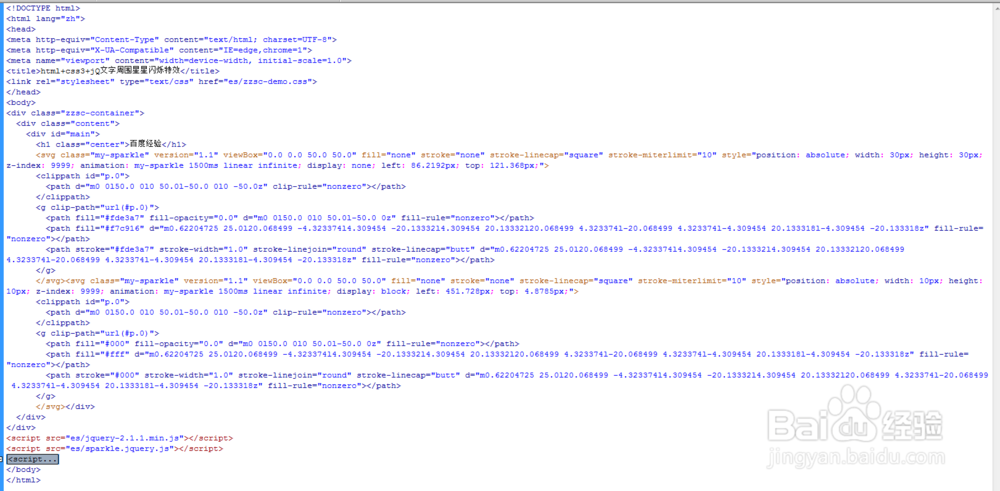
5、代码整体结构。
6、查看效果。