html5+CSS3红心点赞动画按钮效果
1、新建html文档。

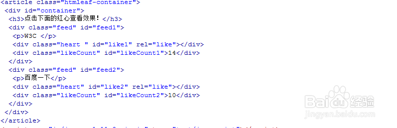
2、书写hmtl代码。
<article class="htmleaf-container">
<div id="container">
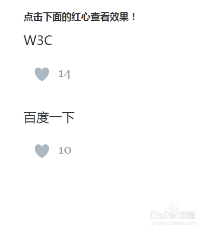
<h3>点击下面的红心查看效果!</h3>
<div class="feed" id="feed1">
W3C
<div class="heart " id="like1" rel="like"></div>
<div class="likeCount" id="likeCount1">14</div>
</div>
<div class="feed" id="feed2">
百度一下
<div class="heart" id="like2" rel="like"></div>
<div class="likeCount" id="likeCount2">10</div>
</div>
</div>
</article>
3、书写css代码。
body { color: #333333; }
#container { margin: 0 auto; width: 900px; font-family: arial; }
#container h3 { font-family: "Microsoft YaHei"; }
.heart { background: url(../images/web_heart_animation.png); background-position: left; background-repeat: no-repeat; height: 100px; width: 100px; cursor: pointer; position: absolute; left: -14px; background-size: 2900%; }
.heart:hover, .heart:focus { background-position: right; }
@-webkit-keyframes heartBlast { 0% {
background-position: left;
}
100% {
background-position: right;
}
}
@keyframes heartBlast { 0% {
background-position: left;
}
100% {
background-position: right;
}
}
.heartAnimation { display: inline-block; -webkit-animation-name: heartBlast; animation-name: heartBlast; -webkit-animation-duration: .8s; animation-duration: .8s; -webkit-animation-iteration-count: 1; animation-iteration-count: 1; -webkit-animation-timing-function: steps(28); animation-timing-function: steps(28); background-position: right; }
.feed p { font-family: "Microsoft YaHei", 'Georgia', Times, Times New Roman, serif; font-size: 25px; }
.feed { clear: both; margin-bottom: :20px;
height: 150px; position: relative; }
a { color: #7ac9ed; }
p { margin: 0px; padding: 0px; }
.likeCount { font-family: 'Georgia', Times, Times New Roman, serif; margin-top: 32px; margin-left: 68px; font-size: 25px; color: #999999 }

4、书写并引用js代码。
<script src="js/jquery-1.11.0.min.js" ></script>
<script>
$(document).ready(function()
{
$('body').on("click",'.heart',function()
{
var A=$(this).attr("id");
var B=A.split("like");
var messageID=B[1];
var C=parseInt($("#likeCount"+messageID).html());
$(this).css("background-position","")
var D=$(this).attr("rel");
if(D === 'like')
{
$("#likeCount"+messageID).html(C+1);
$(this).addClass("heartAnimation").attr("rel","unlike");
}
else
{
$("#likeCount"+messageID).html(C-1);
$(this).removeClass("heartAnimation").attr("rel","like");
$(this).css("background-position","left");
}
});
});
</script>

5、代码整体结构。

6、查看效果。