如何用CSS代码做方框形标题效果
1、案例分析:我们要做两个标题边框字,一个就是普通的边框线条与文字所组成的效果,另外一个就是实底的边框字,并且让边框字有着一个非常酷炫的旋转角度。
2、代码实现:两个不同边框样式的声明,两个不同文本字内容的声明。

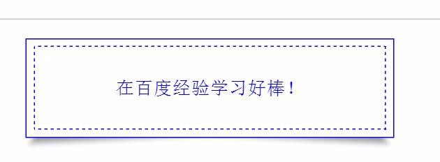
3、标题边框字一的代码流程:一个边框、一个文字,一个阴影这样的三个元素的样式。
<section style="
width:20em;
margin:1em auto;
text-align: center;" id="标题字" >
<section class="ipaiban" style="padding: 6px; border: 1px solid blue; color: blue; transform: rotate(360deg); background-color: white;">
<section class="ipaiban" style="border: 1px dashed blue; padding: 10px;">
<p class="wihudong" style="color: blue;">
在百度经验学习好棒!
</section>
</section>
<section style="
background-image: url(***.png);
background-repeat: no-repeat;
background-size: 100% auto;
width: 20em;
height: 3em;
margin-top: -1.9em;
"></section>
</section>
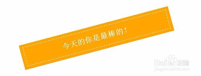
4、长标题二文字的效果。旋转角度是通过代码rotate(345deg);实现的。
<section style="
width:20em;
margin:1em auto;
text-align: center;" id="标题2" >
<section class="xhr" style="padding: 6px; color: white; transform: rotate(345deg); background-color: orange;">
<section class="wihudong" style="border: 1px dashed white; padding: 10px; color: white;">
今天的你是最棒的!
</section>
</section>
</section>
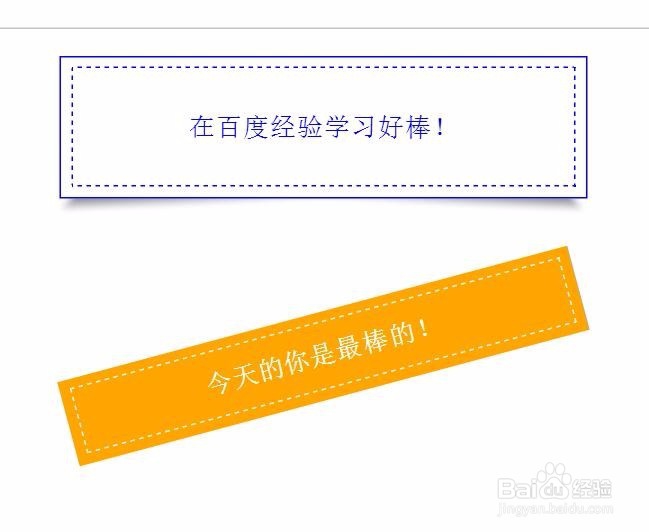
5、检查一下整个代码的流程,我们运行一下就可以得到完整的标题效果。从两个不同的标题上面,我们可以感受一下这种CSS样式的效果的不同。
6、我们可以通过修改参数来让网页元素的内容与效果更丰富。
<section style="
width:10em;
margin:1em auto;
text-align: center;" id="标题2" >
<section class="xhr" style="padding: 3px; color: white; transform: rotate(345deg); background-color: orange;">
<section class="wihudong" style="border: 2px dashed white; padding: 3px; color: white;">
天天快乐!
</section>
</section>
