CSS3 SVG绘制模拟旗帜飘动特效
1、新建html文档。

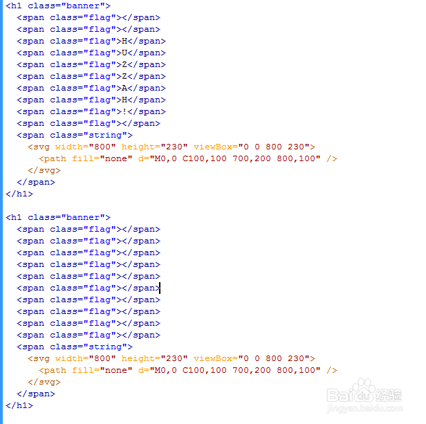
2、书写hmtl代码。
<h1 class="banner">
<span class="flag"></span>
<span class="flag"></span>
<span class="flag">H</span>
<span class="flag">U</span>
<span class="flag">Z</span>
<span class="flag">Z</span>
<span class="flag">A</span>
<span class="flag">H</span>
<span class="flag">!</span>
<span class="flag"></span>
<span class="string">
<svg width="800" height="230" viewBox="0 0 800 230">
<path fill="none" d="M0,0 C100,100 700,200 800,100" />
</svg>
</span>
</h1>
<h1 class="banner">
<span class="flag"></span>
<span class="flag"></span>
<span class="flag"></span>
<span class="flag"></span>
<span class="flag"></span>
<span class="flag"></span>
<span class="flag"></span>
<span class="flag"></span>
<span class="flag"></span>
<span class="flag"></span>
<span class="string">
<svg width="800" height="230" viewBox="0 0 800 230">
<path fill="none" d="M0,0 C100,100 700,200 800,100" />
</svg>
</span>
</h1>
3、书写css代码。
<style>
.banner {
width: 800px;
height: 100px;
border: 0px dotted cyan;
position: relative;
transform-style: preserve-3d;
transform: var(--transform);
--transform: scale(1);
display: none;
}
.banner {
display: flex;
justify-content: space-between;
}
.flag {
display: flex;
height: 70px;
width: 45px;
background: hsl(var(--hue,43), 90%, 55%);
color: hsl(43, 90%, var(--text,5%));
clip-path: polygon(0% 0%, 100% 0%, 50% 100%);
transform-origin: 50% 0%;
justify-content: center;
align-items: center;
padding-bottom: 1rem;
}
.string {
display: none;
}
.flag:nth-of-type(odd) {
--hue: 343;
--text: 95%;
}
.banner:nth-of-type(even) .flag:nth-of-type(even) {
--hue: 333;
}
.banner:nth-of-type(even) .flag:nth-of-type(odd) {
--hue: 193;
}
.banner:nth-of-type(3) .flag:nth-of-type(odd) {
--hue: 33;
}
.banner:nth-of-type(3) .flag:nth-of-type(even) {
--hue: 173;
}
@supports (offset-path: path('M0,0 C100,100 700,200 800,100')) {
.banner {
height: 230px;
}
.banner:nth-of-type(even) {
--transform: rotate(0deg);
}
.banner:nth-of-type(2) {
--transform: scaleX(-1) rotate(-8deg);
}
.banner:nth-of-type(1) {
--transform: rotate(-4deg);
}
.flag:not(.string) {
position: absolute;
offset-anchor: 50% 0%;
offset-path: path('M0,0 C100,100 700,200 800,100');
}
.string,
.string svg {
position: absolute;
width: 800px;
top: 0;
left: 0;
height: 230px;
display: block;
background: transparent;
clip-path: none;
}
.string path {
stroke: hsla(183, 20%, 30%, .3);
stroke-width: 1px;
d: path('M0,0 C100,100 700,200 800,100');
}
}
body {
height: 100vh;
display: flex;
justify-content: center;
align-items: center;
flex-direction: column;
overflow: hidden;
perspective: 700px;
background: hsl(183, 100%, 95.25%);
}
*, *::before, *::after {
box-sizing: border-box;
}</style>

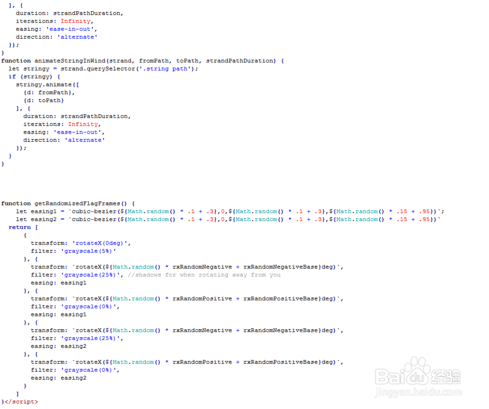
4、书写并添加js代码。
<script>
const strands = Array.from(document.querySelectorAll('.banner'));
const duration = 5450;
const supportsOffsetPath =
window.CSS
&& CSS.supports
&& CSS.supports('offset-path', "path('M0,0 L1,1')");
const rxRandomNegative = -20;
const rxRandomNegativeBase = -30;
const rxRandomPositive = 40;
const rxRandomPositiveBase = 30;
if (document.documentElement.animate) {
strands.forEach(animateStrands);
}
function animateStrands(strand) {
let flags = Array.from(strand.querySelectorAll('.flag'));
let strandPathDuration = Math.random() * (2 * duration) + duration;
let fromPath = "path('M0,0 C100,100 700,200 800,100')";
let toPath = `path('M0,0 C${Math.random() * 20 + 80},${Math.random() * 20 + 80} ${Math.random() * -50 + 700},${Math.random() * 100} 800,100')`;
flags.forEach((flag, i) => {
flag.style.offsetDistance = `${80 + i * 740 / flags.length}px`;
animateWindRotate(flag);
animateWindCurve(flag, fromPath, toPath, strandPathDuration);
});
if (supportsOffsetPath) {
animateStringInWind(strand, fromPath, toPath, strandPathDuration);
}
}
function animateWindRotate(flag) {
flag.animate(getRandomizedFlagFrames(), {
duration: duration,
iterations: Infinity,
direction: 'alternate',
delay: 1000 * Math.random() - 1000
});
}
function animateWindCurve(flag, fromPath, toPath, strandPathDuration) {
flag.animate([
{offsetPath: fromPath},
{offsetPath: toPath}
], {
duration: strandPathDuration,
iterations: Infinity,
easing: 'ease-in-out',
direction: 'alternate'
});
}
function animateStringInWind(strand, fromPath, toPath, strandPathDuration) {
let stringy = strand.querySelector('.string path');
if (stringy) {
stringy.animate([
{d: fromPath},
{d: toPath}
], {
duration: strandPathDuration,
iterations: Infinity,
easing: 'ease-in-out',
direction: 'alternate'
});
}
}
function getRandomizedFlagFrames() {
let easing1 = `cubic-bezier(${Math.random() * .1 + .3},0,${Math.random() * .1 + .3},${Math.random() * .15 + .95})`;
let easing2 = `cubic-bezier(${Math.random() * .1 + .3},0,${Math.random() * .1 + .3},${Math.random() * .15 + .95})`
return [
{
transform: 'rotateX(0deg)',
filter: 'grayscale(5%)'
}, {
transform: `rotateX(${Math.random() * rxRandomNegative + rxRandomNegativeBase}deg)`,
filter: 'grayscale(25%)', //shadows for when rotating away from you
easing: easing1
}, {
transform: `rotateX(${Math.random() * rxRandomPositive + rxRandomPositiveBase}deg)`,
filter: 'grayscale(0%)',
easing: easing1
}, {
transform: `rotateX(${Math.random() * rxRandomNegative + rxRandomNegativeBase}deg)`,
filter: 'grayscale(25%)',
easing: easing2
}, {
transform: `rotateX(${Math.random() * rxRandomPositive + rxRandomPositiveBase}deg)`,
filter: 'grayscale(0%)',
easing: easing2
}
]
}</script>
5、代码整体结构。

6、查看效果。