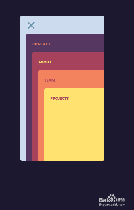
html5+css3+jquery实现卡片堆叠展示导航
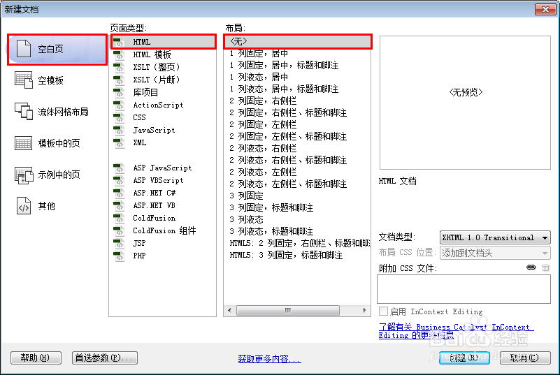
1、新建html文档。
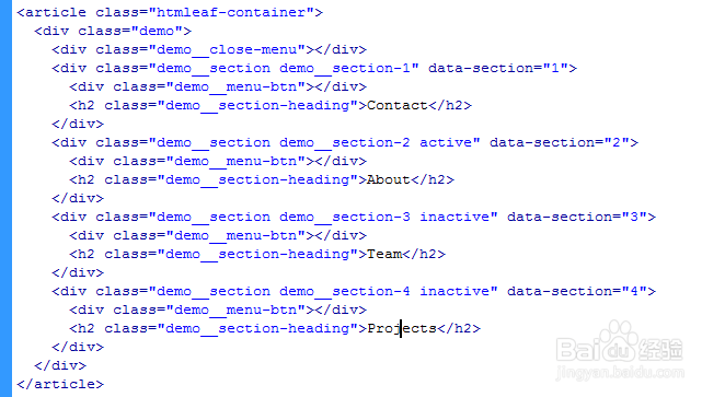
2、书写hmtl代码。
<article class="htmleaf-container">
<div class="demo">
<div class="demo__close-menu"></div>
<div class="demo__section demo__section-1" data-section="1">
<div class="demo__menu-btn"></div>
<h2 class="demo__section-heading">Contact</h2>
</div>
<div class="demo__section demo__section-2 active" data-section="2">
<div class="demo__menu-btn"></div>
<h2 class="demo__section-heading">About</h2>
</div>
<div class="demo__section demo__section-3 inactive" data-section="3">
<div class="demo__menu-btn"></div>
<h2 class="demo__section-heading">Team</h2>
</div>
<div class="demo__section demo__section-4 inactive" data-section="4">
<div class="demo__menu-btn"></div>
<h2 class="demo__section-heading">Projects</h2>
</div>
</div>
</article>
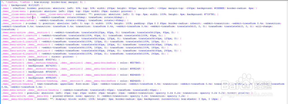
3、书写css代码。
*, *:before, *:after { box-sizing: border-box; margin: 0; }
body { background: #1C182F; }
.demo { overflow: hidden; position: absolute; left: 50%; top: 50%; width: 280px; height: 480px; margin-left: -140px; margin-top: -240px; background: #CDDBEE; border-radius: 6px; }
.demo__close-menu { position: absolute; left: 22px; top: 22px; width: 29px; cursor: pointer; }
.demo__close-menu:before, .demo__close-menu:after { content: ""; position: absolute; left: 0; top: 8px; width: 100%; height: 4px; background: #7097B0; }
.demo__close-menu:before { -webkit-transform: rotate(45deg); transform: rotate(45deg); }
.demo__close-menu:after { -webkit-transform: rotate(-45deg); transform: rotate(-45deg); }
.demo__section { z-index: 1; position: absolute; left: 0; top: 0; width: 100%; height: 100%; padding: 25px 0 0 65px; border-radius: inherit; -webkit-transition: -webkit-transform 0.4s; transition: -webkit-transform 0.4s; transition: transform 0.4s; transition: transform 0.4s, -webkit-transform 0.4s; -webkit-transform: translate3d(0, 0, 0); transform: translate3d(0, 0, 0); will-change: transform; }
.demo.menu-active .demo__section-1 { -webkit-transform: translate3d(20px, 60px, 0); transform: translate3d(20px, 60px, 0); }
.demo__section-1.inactive { -webkit-transform: translate3d(100%, 60px, 0); transform: translate3d(100%, 60px, 0); }
.demo.menu-active .demo__section-2 { -webkit-transform: translate3d(40px, 120px, 0); transform: translate3d(40px, 120px, 0); }
.demo__section-2.inactive { -webkit-transform: translate3d(100%, 120px, 0); transform: translate3d(100%, 120px, 0); }
.demo.menu-active .demo__section-3 { -webkit-transform: translate3d(60px, 180px, 0); transform: translate3d(60px, 180px, 0); }
.demo__section-3.inactive { -webkit-transform: translate3d(100%, 180px, 0); transform: translate3d(100%, 180px, 0); }
.demo.menu-active .demo__section-4 { -webkit-transform: translate3d(80px, 240px, 0); transform: translate3d(80px, 240px, 0); }
.demo__section-4.inactive { -webkit-transform: translate3d(100%, 240px, 0); transform: translate3d(100%, 240px, 0); }
.demo.menu-active .demo__section { cursor: pointer; }
.demo__section-1 { background: #563761; }
.demo__section-1 .demo__section-heading, .demo__section-1 .demo__menu-btn:before { color: #E57B60; }
.demo__section-2 { background: #A7425C; }
.demo__section-2 .demo__section-heading, .demo__section-2 .demo__menu-btn:before { color: #FFE26F; }
.demo__section-3 { background: #F3825F; }
.demo__section-3 .demo__section-heading, .demo__section-3 .demo__menu-btn:before { color: #AD4A5D; }
.demo__section-4 { background: #FFE26F; }
.demo__section-4 .demo__section-heading, .demo__section-4 .demo__menu-btn:before { color: #AD4A5D; }
.demo__section-heading { text-transform: uppercase; font-size: 12px; -webkit-transition: -webkit-transform 0.4s; transition: -webkit-transform 0.4s; transition: transform 0.4s; transition: transform 0.4s, -webkit-transform 0.4s; }
.demo.menu-active .demo__section-heading { -webkit-transform: translateX(-45px); transform: translateX(-45px); }
.demo__menu-btn { position: absolute; left: 20px; top: 20px; width: 28px; height: 22px; -webkit-transition: opacity 0.2s 0.2s; transition: opacity 0.2s 0.2s; cursor: pointer; }
.demo.menu-active .demo__menu-btn { pointer-events: none; opacity: 0; -webkit-transition: opacity 0.2s; transition: opacity 0.2s; }
.demo__menu-btn:before { content: ""; display: block; width: 100%; height: 3px; border-radius: 2px; background: currentColor; box-shadow: 0 8px, 0 16px; }
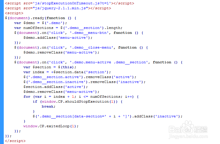
4、书写并添加js代码。
<script src='js/stopExecutionOnTimeout.js?t=1'></script>
<script src="js/jquery-2.1.1.min.js"></script>
<script>
$(document).ready(function () {
var $demo = $('.demo');
var numOfSections = $('.demo__section').length;
$(document).on('click', '.demo__menu-btn', function () {
$demo.addClass('menu-active');
});
$(document).on('click', '.demo__close-menu', function () {
$demo.removeClass('menu-active');
});
$(document).on('click', '.demo.menu-active .demo__section', function () {
var $section = $(this);
var index = +$section.data('section');
$('.demo__section.active').removeClass('active');
$('.demo__section.inactive').removeClass('inactive');
$section.addClass('active');
$demo.removeClass('menu-active');
for (var i = index + 1; i <= numOfSections; i++) {
if (window.CP.shouldStopExecution(1)) {
break;
}
$('.demo__section[data-section=' + i + ']').addClass('inactive');
}
window.CP.exitedLoop(1);
});
});
</script>
5、代码整体结构。
6、查看效果。