html+css3+jquery兼容手机的全屏导航下拉特效
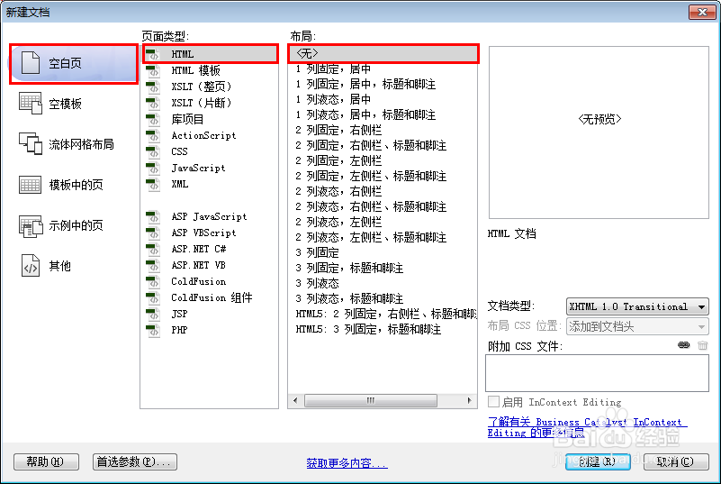
1、新建html文档。
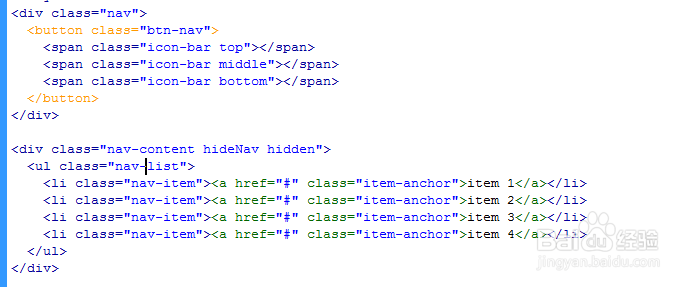
2、书写hmtl代码。
<div class="nav">
<button class="btn-nav">
<span class="icon-bar top"></span>
<span class="icon-bar middle"></span>
<span class="icon-bar bottom"></span>
</button>
</div>
<div class="nav-content hideNav hidden">
<ul class="nav-list">
<li class="nav-item"><a href="#" class="item-anchor">item 1</a></li>
<li class="nav-item"><a href="#" class="item-anchor">item 2</a></li>
<li class="nav-item"><a href="#" class="item-anchor">item 3</a></li>
<li class="nav-item"><a href="#" class="item-anchor">item 4</a></li>
</ul>
</div>
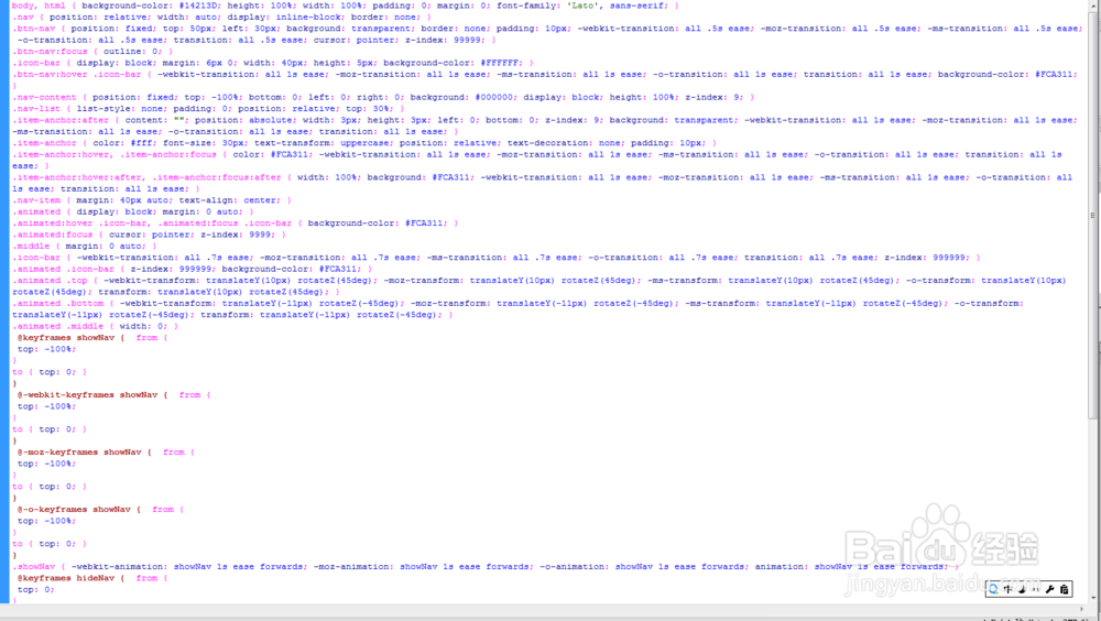
3、书写css代码。
body, html { background-color: #14213D; height: 100%; width: 100%; padding: 0; margin: 0; font-family: 'Lato', sans-serif; }
.nav { position: relative; width: auto; display: inline-block; border: none; }
.btn-nav { position: fixed; top: 50px; left: 30px; background: transparent; border: none; padding: 10px; -webkit-transition: all .5s ease; -moz-transition: all .5s ease; -ms-transition: all .5s ease; -o-transition: all .5s ease; transition: all .5s ease; cursor: pointer; z-index: 99999; }
.btn-nav:focus { outline: 0; }
.icon-bar { display: block; margin: 6px 0; width: 40px; height: 5px; background-color: #FFFFFF; }
.btn-nav:hover .icon-bar { -webkit-transition: all 1s ease; -moz-transition: all 1s ease; -ms-transition: all 1s ease; -o-transition: all 1s ease; transition: all 1s ease; background-color: #FCA311; }
.nav-content { position: fixed; top: -100%; bottom: 0; left: 0; right: 0; background: #000000; display: block; height: 100%; z-index: 9; }
.nav-list { list-style: none; padding: 0; position: relative; top: 30%; }
.item-anchor:after { content: ""; position: absolute; width: 3px; height: 3px; left: 0; bottom: 0; z-index: 9; background: transparent; -webkit-transition: all 1s ease; -moz-transition: all 1s ease; -ms-transition: all 1s ease; -o-transition: all 1s ease; transition: all 1s ease; }
.item-anchor { color: #fff; font-size: 30px; text-transform: uppercase; position: relative; text-decoration: none; padding: 10px; }
.item-anchor:hover, .item-anchor:focus { color: #FCA311; -webkit-transition: all 1s ease; -moz-transition: all 1s ease; -ms-transition: all 1s ease; -o-transition: all 1s ease; transition: all 1s ease; }
.item-anchor:hover:after, .item-anchor:focus:after { width: 100%; background: #FCA311; -webkit-transition: all 1s ease; -moz-transition: all 1s ease; -ms-transition: all 1s ease; -o-transition: all 1s ease; transition: all 1s ease; }
.nav-item { margin: 40px auto; text-align: center; }
.animated { display: block; margin: 0 auto; }
.animated:hover .icon-bar, .animated:focus .icon-bar { background-color: #FCA311; }
.animated:focus { cursor: pointer; z-index: 9999; }
.middle { margin: 0 auto; }
.icon-bar { -webkit-transition: all .7s ease; -moz-transition: all .7s ease; -ms-transition: all .7s ease; -o-transition: all .7s ease; transition: all .7s ease; z-index: 999999; }
.animated .icon-bar { z-index: 999999; background-color: #FCA311; }
.animated .top { -webkit-transform: translateY(10px) rotateZ(45deg); -moz-transform: translateY(10px) rotateZ(45deg); -ms-transform: translateY(10px) rotateZ(45deg); -o-transform: translateY(10px) rotateZ(45deg); transform: translateY(10px) rotateZ(45deg); }
.animated .bottom { -webkit-transform: translateY(-11px) rotateZ(-45deg); -moz-transform: translateY(-11px) rotateZ(-45deg); -ms-transform: translateY(-11px) rotateZ(-45deg); -o-transform: translateY(-11px) rotateZ(-45deg); transform: translateY(-11px) rotateZ(-45deg); }
.animated .middle { width: 0; }
@keyframes showNav { from {
top: -100%;
}
to { top: 0; }
}
@-webkit-keyframes showNav { from {
top: -100%;
}
to { top: 0; }
}
@-moz-keyframes showNav { from {
top: -100%;
}
to { top: 0; }
}
@-o-keyframes showNav { from {
top: -100%;
}
to { top: 0; }
}
.showNav { -webkit-animation: showNav 1s ease forwards; -moz-animation: showNav 1s ease forwards; -o-animation: showNav 1s ease forwards; animation: showNav 1s ease forwards; }
@keyframes hideNav { from {
top: 0;
}
to { top: -100%; }
}
@-webkit-keyframes hideNav { from {
top: 0;
}
to { top: -100%; }
}
@-moz-keyframes hideNav { from {
top: 0;
}
to { top: -100%; }
}
@-o-keyframes hideNav { from {
top: 0;
}
to { top: -100%; }
}
.hideNav { -webkit-animation: hideNav 1s ease forwards; -moz-animation: hideNav 1s ease forwards; -o-animation: hideNav 1s ease forwards; animation: hideNav 1s ease forwards; }
.hidden { display: none; }
4、书写并添加js代码。
<script src="js/jquery-2.1.1.min.js"></script>
<script>
$(window).load(function () {
$('.btn-nav').on('click tap', function () {
$('.nav-content').toggleClass('showNav hideNav').removeClass('hidden');
$(this).toggleClass('animated');
});
});
</script>

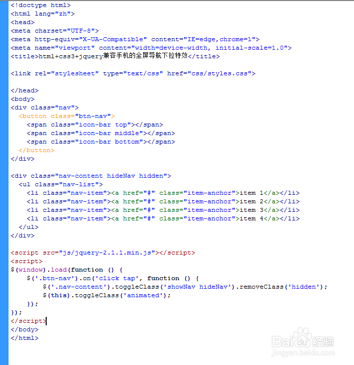
5、代码整体结构。
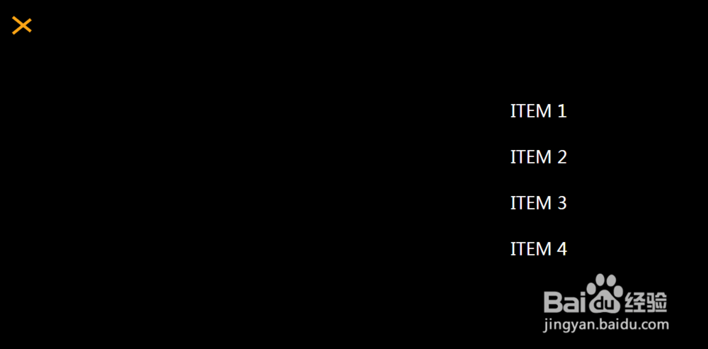
6、查看效果。