css3实现的图片边框阴影特效
1、准备好需要用到的图标。

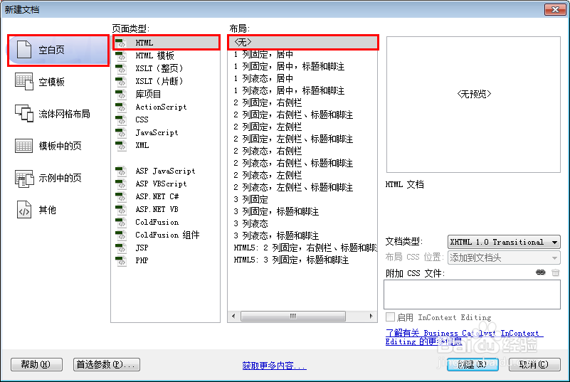
2、新建html文档。
3、书写hmtl代码。
<div id="wrapper">
<h2>css3实现的图片边框阴影特效</h2>
<div class="photo">
<img src="images/bag.jpg" alt="Bag">
</div>
</div>

4、初始化css代码。
<style>
a, abbr, acronym, address, applet, article, aside, audio, b, blockquote, big, body, center, canvas, caption, cite, code, command, datalist, dd, del, details, dfn, dl, div, dt, em, embed, fieldset, figcaption, figure, font, footer, form, h1, h2, h3, h4, h5, h6, header, hgroup, html, i, iframe, img, ins, kbd, keygen, label, legend, li, meter, nav, object, ol, output, p, pre, progress, q, s, samp, section, small, span, source, strike, strong, sub, sup, table, tbody, tfoot, thead, th, tr, tdvideo, tt, u, ul, var { background: transparent; border: 0 none; font-size: 100%; margin: 0; padding: 0; vertical-align: baseline; }
</style>

5、书写css代码。
body { background: #fff; font-family: 'Anton', sans-serif; text-shadow: 0 1px #fff; }
#wrapper { margin: 30px auto; width: 600px; }
.photo { margin: 30px auto; display: block; height: 401px; width: 602px; -webkit-box-shadow: 0 2px 10px rgba(0, 0, 0, .5), 0 2px 3px rgba(0, 0, 0, .5); -moz-box-shadow: 0 2px 10px rgba(0, 0, 0, .5), 0 2px 3px rgba(0, 0, 0, .5); -o-box-shadow: 0 2px 10px rgba(0, 0, 0, .5), 0 2px 3px rgba(0, 0, 0, .5); box-shadow: 0 2px 10px rgba(0, 0, 0, .5), 0 2px 3px rgba(0, 0, 0, .5); position: relative; }
.photo img { width: 100%; }
.photo:before { content: ""; position: absolute; top: 0; right: 0; bottom: 0; left: 0; background: -webkit-gradient(linear, 0% 0%, 0% 100%, from(rgba(255, 255, 255, .15)), to(rgba(0, 0, 0, .25))), -webkit-gradient(linear, left top, right bottom, color-stop(0, rgba(255, 255, 255, 0)), color-stop(0.5, rgba(255, 255, 255, .1)), color-stop(0.501, rgba(255, 255, 255, 0)), color-stop(1, rgba(255, 255, 255, 0))); background: -moz-linear-gradient(top, rgba(255, 255, 255, .15), rgba(0, 0, 0, .25)), -moz-linear-gradient(left top, rgba(255, 255, 255, 0), rgba(255, 255, 255, .1) 50%, rgba(255, 255, 255, 0) 50%, rgba(255, 255, 255, 0)); background: linear-gradient(top, rgba(255, 255, 255, .15), rgba(0, 0, 0, .25)), linear-gradient(left top, rgba(255, 255, 255, 0), rgba(255, 255, 255, .1) 50%, rgba(255, 255, 255, 0) 50%, rgba(255, 255, 255, 0)); }
h1 { font-weight: 700; font-size: 50px; text-align: center; }
h2 { font-weight: 400; font-size: 25px; text-align: center; }

6、代码整体结构。

7、查看效果。
