jQuery Mobile教程: 网格
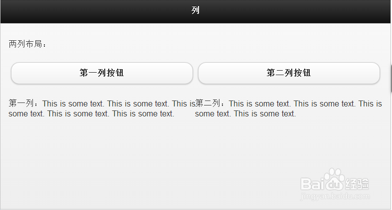
1、两列布局
<div data-role="content">
两列布局:
<div class="ui-grid-a">
<div class="ui-block-a"><a href="#" data-role="button">第一列按钮</a><br>
<span>第一列:This is some text. This is some text. This is some text. This is some text. This is some text.</span>
</div>
<div class="ui-block-b">
<a href="#" data-role="button">第二列按钮</a><br>
<span>第二列:This is some text. This is some text. This is some text. This is some text.</span>
</div>
</div>
</div>
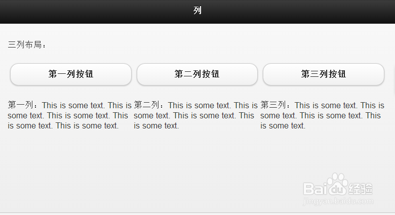
2、三列布局
<div data-role="content">
三列布局:
<div class="ui-grid-b">
<div class="ui-block-a"><a href="#" data-role="button">第一列按钮</a><br>
<span>第一列:This is some text. This is some text. This is some text. This is some text. This is some text.</span>
</div>
<div class="ui-block-b">
<a href="#" data-role="button">第二列按钮</a><br>
<span>第二列:This is some text. This is some text. This is some text. This is some text.</span>
</div>
<div class="ui-block-c">
<a href="#" data-role="button">第三列按钮</a><br>
<span>第三列:This is some text. This is some text. This is some text. This is some text.</span>
</div>
</div>
</div>
3、四列布局
<div data-role="content">
四列布局:
<div class="ui-grid-c">
<div class="ui-block-a"><a href="#" data-role="button">第一列</a><br>
<span>第一列:This is some text. This is some text. This is some text. This is some text. This is some text.</span>
</div>
<div class="ui-block-b">
<a href="#" data-role="button">第二列</a><br>
<span>第二列:This is some text. This is some text. This is some text. This is some text.</span>
</div>
<div class="ui-block-c">
<a href="#" data-role="button">第三列</a><br>
<span>第三列:This is some text. This is some text. This is some text. This is some text.</span>
</div>
<div class="ui-block-d">
<a href="#" data-role="button">第四列</a><br>
<span>第四列:This is some text. This is some text. This is some text. This is some text.</span>
</div>
</div>
</div>

4、五列布局
<div data-role="content">
五列布局:
<div class="ui-grid-d">
<div class="ui-block-a"><a href="#" data-role="button">第一列</a><br>
<span>第一列:This is some text. This is some text. This is some text. This is some text. This is some text.</span>
</div>
<div class="ui-block-b">
<a href="#" data-role="button">第二列</a><br>
<span>第二列:This is some text. This is some text. This is some text. This is some text.</span>
</div>
<div class="ui-block-c">
<a href="#" data-role="button">第三列</a><br>
<span>第三列:This is some text. This is some text. This is some text. This is some text.</span>
</div>
<div class="ui-block-d">
<a href="#" data-role="button">第四列</a><br>
<span>第四列:This is some text. This is some text. This is some text. This is some text.</span>
</div>
<div class="ui-block-e">
<a href="#" data-role="button">第五列</a><br>
<span>第五列:This is some text. This is some text. This is some text. This is some text.</span>
</div>
</div>
</div>

5、自定义网格
<div data-role="content">
三列样式布局:
<div class="ui-grid-b">
<div class="ui-block-a"><span>第一个列</span></div>
<div class="ui-block-b"><span>第二个列</span></div>
<div class="ui-block-c"><span>第三个列</span></div>
</div>
</div>

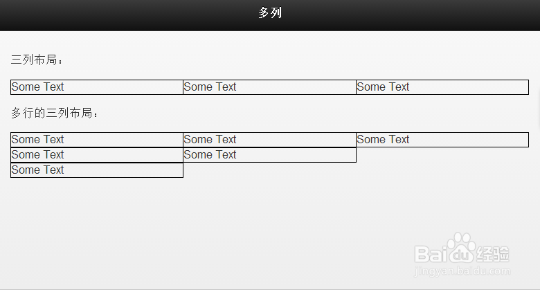
6、列中的多行
<div data-role="content">
三列布局:
<div class="ui-grid-b">
<div class="ui-block-a" style="border: 1px solid black;"><span>Some Text</span></div>
<div class="ui-block-b" style="border: 1px solid black;"><span>Some Text</span></div>
<div class="ui-block-c" style="border: 1px solid black;"><span>Some Text</span></div>
</div>
多行的三列布局:
<div class="ui-grid-b">
<div class="ui-block-a" style="border: 1px solid black;"><span>Some Text</span></div>
<div class="ui-block-b" style="border: 1px solid black;"><span>Some Text</span></div>
<div class="ui-block-c" style="border: 1px solid black;"><span>Some Text</span></div>
<div class="ui-block-a" style="border: 1px solid black;"><span>Some Text</span></div>
<div class="ui-block-b" style="border: 1px solid black;"><span>Some Text</span></div>
<div class="ui-block-a" style="border: 1px solid black;"><span>Some Text</span></div>
</div>
</div>