Bootstrap向下滑动的选项卡
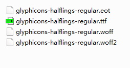
1、准备好需要用到的字体图标。
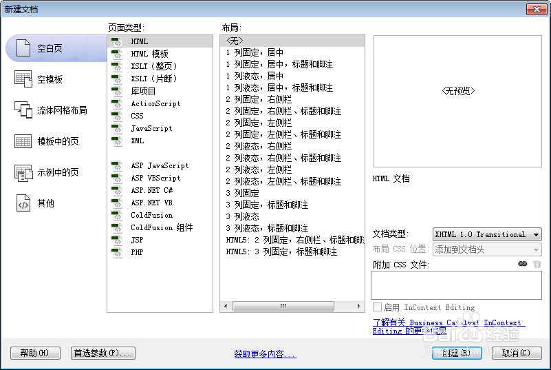
2、新建html文档。
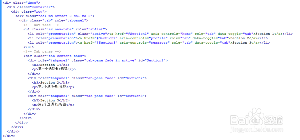
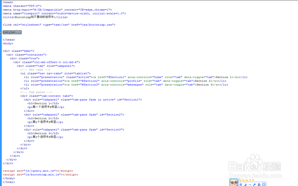
3、书写hmtl代码。
<div class="demo">
<div class="container">
<div class="row">
<div class="col-md-offset-3 col-md-6">
<div class="tab" role="tabpanel">
<!-- Nav tabs -->
<ul class="nav nav-tabs" role="tablist">
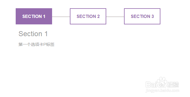
<li role="presentation" class="active"><a href="#Section1" aria-controls="home" role="tab" data-toggle="tab">Section 1</a></li>
<li role="presentation"><a href="#Section2" aria-controls="profile" role="tab" data-toggle="tab">Section 2</a></li>
<li role="presentation"><a href="#Section3" aria-controls="messages" role="tab" data-toggle="tab">Section 3</a></li>
</ul>
<!-- Tab panes -->
<div class="tab-content tabs">
<div role="tabpanel" class="tab-pane fade in active" id="Section1">
<h3>Section 1</h3>
第一个选项卡P标签
</div>
<div role="tabpanel" class="tab-pane fade" id="Section2">
<h3>Section 2</h3>
第2个选项卡P标签
</div>
<div role="tabpanel" class="tab-pane fade" id="Section3">
<h3>Section 3</h3>
第3个选项卡P标签
</div>
</div>
</div>
</div>
</div>
</div>
</div>
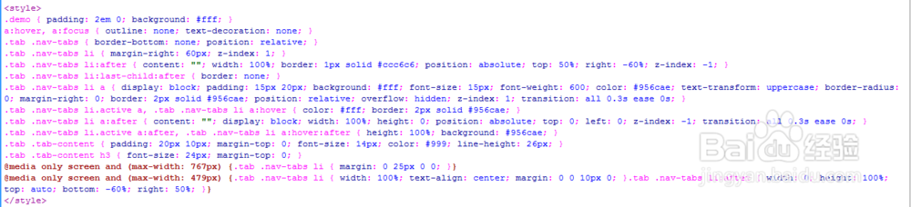
4、书写css代码。
<style>
.demo { padding: 2em 0; background: #fff; }
a:hover, a:focus { outline: none; text-decoration: none; }
.tab .nav-tabs { border-bottom: none; position: relative; }
.tab .nav-tabs li { margin-right: 60px; z-index: 1; }
.tab .nav-tabs li:after { content: ""; width: 100%; border: 1px solid #ccc6c6; position: absolute; top: 50%; right: -60%; z-index: -1; }
.tab .nav-tabs li:last-child:after { border: none; }
.tab .nav-tabs li a { display: block; padding: 15px 20px; background: #fff; font-size: 15px; font-weight: 600; color: #956cae; text-transform: uppercase; border-radius: 0; margin-right: 0; border: 2px solid #956cae; position: relative; overflow: hidden; z-index: 1; transition: all 0.3s ease 0s; }
.tab .nav-tabs li.active a, .tab .nav-tabs li a:hover { color: #fff; border: 2px solid #956cae; }
.tab .nav-tabs li a:after { content: ""; display: block; width: 100%; height: 0; position: absolute; top: 0; left: 0; z-index: -1; transition: all 0.3s ease 0s; }
.tab .nav-tabs li.active a:after, .tab .nav-tabs li a:hover:after { height: 100%; background: #956cae; }
.tab .tab-content { padding: 20px 10px; margin-top: 0; font-size: 14px; color: #999; line-height: 26px; }
.tab .tab-content h3 { font-size: 24px; margin-top: 0; }
@media only screen and (max-width: 767px) {.tab .nav-tabs li { margin: 0 25px 0 0; }}
@media only screen and (max-width: 479px) {.tab .nav-tabs li { width: 100%; text-align: center; margin: 0 0 10px 0; }.tab .nav-tabs li:after { width: 0; height: 100%; top: auto; bottom: -60%; right: 50%; }}
</style>
5、书写并添加js代码。
<script src="js/jquery.min.js"></script>
<script src="js/bootstrap.min.js"></script>

6、代码整体结构。
7、查看效果。